Does Excel Make Histograms? A Practical How-To Guide
Find out whether does excel make histograms and how to build them using built-in charts or manual binning. This XLS Library guide covers methods, bin width, data preparation, and interpretation.

Yes. Excel can create histograms using built-in tools and, for more control, the Analysis Toolpak or manual binning. You can build a histogram chart in modern Excel versions or craft a frequency distribution by bin. This quick answer from XLS Library points you toward a full, practical workflow you can apply to real data.
Overview: does excel make histograms?
Histograms are a foundational chart type for visualizing how numeric data are distributed across values, showing shape, spread, and potential outliers. If you work with data in Excel, you may wonder whether the software can generate this chart type directly or if you should prepare a manual frequency distribution instead. The good news is that Excel supports histograms in recent versions through built-in charts and, for more control, via the Analysis Toolpak or manual binning. According to XLS Library, histograms in Excel empower both aspiring analysts and seasoned professionals to quickly assess data without exporting to a separate tool. In this article, we’ll compare the built-in histogram option with manual workflows, cover data preparation, discuss bin width choices, and walk through a practical example you can adapt to your datasets.
Note: does excel make histograms is a frequent question among data practitioners, and this guide aims to answer it with practical steps and tips.
Built-in histogram charts: what you can do and when to use them
Excel’s built-in histogram chart offers a straightforward path to distribution visualization without extra steps. When you select a numeric data range and choose Insert > Charts > Histogram, Excel builds a chart that groups data into bins and displays the frequency in each bin as vertical bars. This method is ideal for quick analyses, standard reports, or when you’re sharing workbooks with colleagues who expect familiar visuals. The chart automatically computes bin boundaries in many cases, but you can customize bin width and the number of bins to suit the data shape. If your dataset is large or skewed, the built-in chart still communicates the main distribution clearly, and you can pair it with descriptive statistics (mean, median, standard deviation) to enrich interpretation. For educators, analysts, and business users, this option minimizes setup time while delivering publish-ready visuals. As noted by the XLS Library team, mastering the built-in histogram refreshes your data storytelling without requiring advanced tools.
Manual histogram workflow: bin data, frequencies, and charts
Some teams prefer a manual histogram when they need full control over bins, especially with unusual data shapes or regulatory reporting. The manual approach starts with defining bin edges or a bin width, then counting observations that fall into each bin, typically with the FREQUENCY function or a pivot approach. After you compute frequencies, you can plot them using a simple column chart to resemble a histogram. This method gives you precise control over bin boundaries and allows you to display custom labels, combined with a frequency table for documentation. It also lets you experiment with alternative bin schemes to compare distributions across groups. If your dataset changes frequently, consider building a small template that automatically recalculates bins and frequencies when you update the data. As you work, keep an eye on data quality: remove non-numeric values, handle blanks, and ensure the range of data matches the bin definitions. In many workplaces, this approach is favored for its transparency and reproducibility.
Bin width and bin count: balancing detail and readability
Choosing bin width is both an art and a science. Too few bins flatten important features; too many bins create noise. Common strategies include Sturges’ rule, Scott’s rule, and the Freedman–Diaconis rule. In Excel, you can set bin width manually or rely on automatic bins in the histogram chart, then refine by adjusting the number of bins or the width. The key is consistency: apply the same bin logic when comparing multiple datasets. When data are highly skewed or contain outliers, consider separate histograms for subgroups or transforming data (e.g., log scale) to improve readability while preserving the original scale in your report.
Data preparation and cleaning: ensuring accurate histograms
The reliability of a histogram hinges on clean input. Start by validating that all data entries are numeric and remove non-numeric values or convert them to numbers. Decide whether to treat blanks as missing or as a separate bin, especially if you’re analyzing survey responses. If you’re using the manual binning method, ensure the bin edges correspond exactly to your data range and that all data points fall into one and only one bin. Document any data transformations you perform and keep a clean, labeled data sheet for auditability. These practices reduce confusion when stakeholders review the visualization and support reproducible analysis across teams.
Common pitfalls and troubleshooting
Histogram construction can stumble on a few recurring issues: non-numeric data slipping into the data range, inconsistent bin definitions across charts, or misinterpreting the axis due to scale choice. Also check that the data range you plot actually covers all observations, and verify whether you need to exclude outliers or create a separate chart for them. If the histogram appears sparse, try increasing the number of bins modestly; if bars seem crowded, reduce the bin count. When using the Analysis Toolpak, ensure the add-in is enabled and that the input and bin ranges are correctly specified. Finally, remember to pair the histogram with summary statistics to provide context for distribution shape.
Practical example: from dataset to histogram in Excel
Consider a simple data column of test scores. You would first clean the data, then decide on a bin width (e.g., 10-score intervals). Create the histogram using Insert > Charts > Histogram, adjust the bin width, and format the axis to clearly display interval labels. Add a quick stats row with mean and standard deviation for context. This practical workflow helps you see how score distributions cluster, spread, and skew, and it can be adapted to any numeric dataset—from sales figures to manufacturing measurements.
Advanced tips: customizing and sharing histograms
To improve readability, customize colors, axis titles, and bin labels. Add data labels or a tiny legend if you’re comparing multiple distributions. Consider adding a normal curve overlay or density line for advanced audiences, and export the chart as an image for presentations. When sharing, include a note about bin width, data range, and any data transformations used; this increases transparency and helps others reproduce your results.
Interpreting histograms for decision making
Histograms provide a visual summary of data shape: symmetry, skewness, modality (unimodal, bimodal, multimodal), and spread. Use these cues alongside measures like mean, median, and standard deviation to guide decisions—e.g., whether a process is within tolerance, or whether a subset of observations requires attention. If you’re comparing groups, ensure the same bin logic is applied across charts to allow meaningful comparison.
Tools & Materials
- Excel with histogram support (Excel 2016+ or Microsoft 365)(Insert > Charts > Histogram (auto-binning in many cases))
- Data range containing the numeric values(One column/row of numbers, no headers needed in data range)
- Bin definitions or bin width (optional for built-in charts)(If using manual binning, have a separate bin edge column)
- FREQUENCY-based helper column (optional)(Helpful for manual histograms without a built-in binning feature)
- Descriptive statistics (mean, median, stdev)(Useful to accompany the histogram in reports)
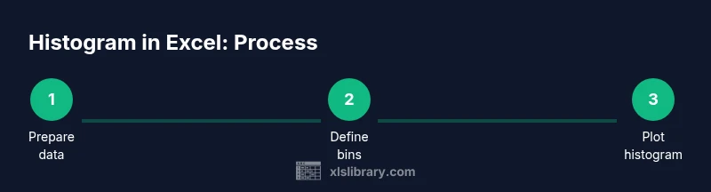
Steps
Estimated time: 30-45 minutes
- 1
Prepare and clean data
Verify all entries are numeric, remove text, fix blanks, and ensure the data range covers all observations you want to visualize. This step prevents misinterpretation caused by non-numeric values.
Tip: Use a dedicated clean column to avoid altering the original dataset. - 2
Choose a bin strategy
Decide between automatic bins or a fixed bin width that matches your reporting needs. If in doubt, start with a moderate width and adjust after visual inspection.
Tip: Document your bin width so others can reproduce the chart. - 3
Create a built-in histogram (recommended)
Select the numeric data, go to Insert > Charts > Histogram, and insert the chart. If necessary, adjust bin width in the chart options.
Tip: Label axes clearly and enable a data label for bin counts if helpful. - 4
Alternatively, build a manual histogram
Create a frequency column (counts per bin) and a bins column, then insert a column chart using the frequency values.
Tip: Use the FREQUENCY function or PivotTable with a calculated field for automation. - 5
Format for clarity
Adjust colors, add titles, and ensure the x-axis shows bin edges or centers accurately. Consider a secondary axis with summary statistics.
Tip: Keep the chart legible in print or on screen by avoiding overly thin bars. - 6
Interpret and report
Analyze shape, skewness, and spread. Pair the histogram with mean/median and note any outliers or unusual gaps.
Tip: Provide a short interpretation paragraph to accompany the visualization.
People Also Ask
Does Excel have a built-in histogram feature?
Yes, most recent Excel versions include a built-in histogram chart type. It provides a quick, publish-ready distribution view.
Yes, Excel has a built-in histogram chart in recent versions.
Do I need the Analysis Toolpak to create a histogram?
Not always. Built-in histograms work in many cases, but the Analysis Toolpak offers additional histogram options and data analysis capabilities.
Not always; the built-in histogram suffices for many cases, with the Toolpak offering extra features.
How should I choose bin width?
Common methods include fixed widths, Sturges', Scott's, or Freedman-Diaconis rules. Start with a standard width and adjust based on how the distribution appears.
Choose a standard bin width and adjust after inspecting the chart.
Can I customize a histogram in Excel?
Yes. You can modify colors, axis labels, bin boundaries, and add titles or data labels to improve clarity.
Yes, you can customize colors, labels, and bin boundaries.
What data format does a histogram require?
A single numeric column is ideal. Remove non-numeric values and ensure there are no stray blanks within the data range.
Use one numeric column and clean the data.
Why might my histogram show gaps or missing bars?
Gaps usually result from incorrect bin definitions or data outside the bin range. Recheck bins and data boundaries.
Typically bin or data range issues; verify definitions.
How do I interpret a histogram for decision making?
Look for skewness, modality, and spread. Combine with descriptive statistics to inform decisions about processes or risks.
Interpret shape and spread alongside stats to guide decisions.
Watch Video
The Essentials
- Choose bin width carefully to reveal distribution shape.
- Use built-in histogram for speed; switch to manual if you need control.
- Clean data before plotting to ensure accuracy.
- Interpret histograms with summary stats and context.
- Document bin definitions for reproducibility.