How Often to Use Flourish Excel: Practical Guidelines
Learn how to integrate Flourish with Excel by choosing update cadences that align with data cycles, dashboards, and reports. Practical, data-driven frequency guidance for aspiring and professional Excel users.

To decide how often to use Flourish with Excel, align updates with your data refresh cycle, project needs, and audience. For most dashboards, refresh visuals weekly or after each data import; for static reports, monthly updates may suffice. Start with a baseline and scale as needed. Monitor user feedback to adjust frequency and ensure performance.
how often to use flourish excel
According to XLS Library, establishing a practical cadence for Flourish visualizations inside Excel workflows helps keep dashboards relevant without overwhelming audiences. The goal is to balance freshness with consistency. The XLS Library team has found that the right frequency varies by data volatility, stakeholder needs, and report cadence. In general, start by aligning your Flourish export or embedding schedule with your data refresh calendar, then adjust based on utilization signals and performance. This approach creates a measurable cadence you can adapt across projects, teams, and industries.
Understanding Your Data Update Cycles
Data update cycles determine how often Flourish visuals should reflect the underlying numbers. If your Excel workbook pulls data from a live source or a regularly updated database, frequencies could be daily or weekly. For static exports, less frequent updates are acceptable. Consider data latency, the risk of stale visuals, and the decision-making timeline of your audience. Use real-world examples: a sales dashboard that updates after nightly ETL runs; a quarterly financial slide deck that redraws visuals after closing entries; or an operations board that refreshes on a weekly cycle. Document the data sources, update triggers, and any data-cleaning steps so that your team can reproduce the cadence consistently. According to XLS Library, clear data lineage is a key driver of trust in visual storytelling and reduces maintenance costs over time.
Balancing Freshness and Stability
Fresh visuals are exciting and can drive engagement, but too-frequent changes can confuse viewers and erode trust if underlying data or definitions shift. The balance point depends on how quickly your data evolves, how critical up-to-date visuals are for decision-making, and the size of your audience. In practice, you can achieve stability by setting baselines, using versioned embeds, and tagging visuals with last-updated dates. When data definitions change, communicate the change and implement a brief pause in publishing until stakeholders validate the update. Flourish visuals tied to Excel should maintain a consistent layout and color scheme to minimize cognitive load during updates.
How to Choose a Baseline Frequency
Start with a baseline that matches your data cadence and business rhythm. If data refreshes nightly, a weekly Flourish update often suffices for dashboards. If data is refreshed hourly, consider two tiers: a near-real-time embed for executives and a nightly update for operational teams. Document the rationale for your baseline in a shared guide and review it quarterly. Ensure your baseline aligns with governance policies, security considerations, and accessibility requirements so that all users view consistent visuals. The baseline is your reference point for evaluating whether to adjust cadence up or down.
Weekly vs Monthly: When to Use Flourish Visuals
Weekly updates are ideal for operational dashboards and sales pipelines where yesterday’s data can influence today’s actions. Monthly updates suit strategic reports, annual planning decks, and archived presentations where you want a clean, historical view without examing every minor fluctuation. When choosing, consider stakeholder needs, decision timelines, and the cost of stale visuals. Use a release calendar to coordinate embed refreshes and publish notes that explain any notable changes to the audience.
Practical Examples: Dashboards, Reports, and Ad-Hoc Visuals
Dashboards for operations teams typically benefit from a weekly cadence, with a short note on any data quality issues. Executive dashboards may use a bi-weekly or monthly cadence to highlight trends, with ad-hoc Flourish visuals created for special reports. Regular reports that get distributed to a broad audience should follow a predictable cadence (e.g., every Friday) so recipients know when to expect updates. For ad-hoc visuals, create a lightweight flow that can be invoked on demand but still adheres to your data governance standards.
Automation and Scheduling in Excel-Flourish Workflows
Automating parts of the workflow saves time and reduces human error. Use Excel to export data to a structured format, then connect Flourish visuals via embedded charts or publish-ready exports. Establish a refresh script or macro that triggers the Flourish update on a set schedule, or rely on Flourish’s embed refresh options when available. The goal is to minimize manual steps while preserving data integrity and reproducibility. XLS Library analysis highlights that automation improves reliability and frees teams to focus on analysis rather than repetitive publishing tasks.
Data Governance and Version Control
Maintain a simple but robust versioning system for Flourish visuals and their Excel data sources. Use clear naming conventions that include date stamps and revision numbers (e.g., Sales_KPIs_v2026_02_15). Keep a changelog that records what changed, why, and who approved the update. This practice reduces confusion when multiple teams work with the same dashboards and helps you roll back to a previous state if needed. Implement access controls so only authorized users can modify critical visuals and data sources.
Common Pitfalls and How to Avoid Them
Avoid overloading viewers with constant changes or inconsistent visuals. Do not publish visuals without validating the data source and definitions first. Prevent drift by keeping a single source of truth for metrics and ensuring Flourish visuals reflect that source consistently. When in doubt, run a quick stakeholder check before a cadence change and document the decision rationale for future audits.
Tools, Templates, and Best Practices
Develop templates that capture cadence decisions, data sources, and update steps. Use a shared glossary for metrics to avoid misinterpretation. Maintain a simple automation blueprint that describes required scripts, triggers, and failure alerts. Share best practices across teams to promote consistency, reduce onboarding time, and improve overall data literacy within the organization.
Tools & Materials
- Computer with Excel installed (Microsoft 365 recommended)(Ensure latest updates; supports Flourish embeds and data exports)
- Flourish account (free or paid)(Access to Flourish visuals and embed/export options)
- Stable internet connection(To fetch Flourish assets and publish embeds)
- Sample Excel workbook with data sources(For practice and testing cadence changes)
- Data sources and refresh credentials(Optional for automated workflows; required for live connections)
- CHANGELOG template(Record cadence decisions and updates)
Steps
Estimated time: 2-4 hours
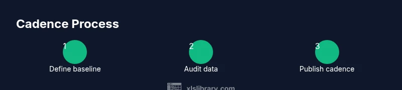
- 1
Define the baseline cadence
Identify the default update frequency based on data velocity and stakeholder needs. Create a short document that explains the baseline and the rationale behind it. Align this baseline with your data governance policy and publish it in a shared space.
Tip: Include a sample release calendar to visualize the cadence across reports. - 2
Audit data sources and update triggers
List all data sources, refresh points, and transformation steps. Highlight any data quality checks that must pass before visuals refresh. This ensures accuracy and trust in the Flourish visuals connected to Excel data.
Tip: Maintain a data lineage diagram for quick reference. - 3
Create Flourish visuals in Excel
Build or import Flourish visuals that map to your Excel data. Use consistent layouts and color schemes to reduce cognitive load. Document metric definitions so updates remain meaningful over time.
Tip: Save a template with a standard layout for new visuals. - 4
Set up refresh or publish schedule
Configure the schedule using Excel macros or Flourish embed refresh, or rely on a manual update cycle with a published changelog. Ensure notifications go to relevant stakeholders when visuals update.
Tip: Test the schedule with a mock data run to catch failures. - 5
Validate visuals with stakeholders
Before official publishing, have a quick review with key users to confirm data accuracy, metric definitions, and the cadence. Collect feedback and adjust the baseline if needed.
Tip: Use a feedback form to capture consistent input. - 6
Review and adjust cadence regularly
Schedule periodic audits (quarterly or after major data changes) to determine if the cadence still suits the audience. Update the cadence document and templates accordingly.
Tip: Set reminders to revisit cadences during org-wide data reviews.
People Also Ask
How do I determine the best frequency for Flourish visuals?
Start with a baseline aligned to your data refresh cycle and decision-making rhythm. Validate with stakeholders and adjust as needed. Document the rationale so teams can reproduce the cadence.
Begin with a baseline that matches how often your data changes and how quickly decisions are made, then adjust with stakeholder feedback.
Is weekly updating always necessary for dashboards?
Not always. Weekly updates work well for operational dashboards, but strategic dashboards may succeed with bi-weekly or monthly cadences. Choose based on data change rate and audience needs.
Weekly can work well for operations, but adjust to fit how often your data changes and what your audience requires.
Can I automate Flourish updates from Excel?
Yes. Use Excel data exports and Flourish embeds or API-based refresh where available. Automating reduces manual steps and helps maintain consistency across reports.
Automation is possible; it helps keep visuals current with less manual work.
How should cadence vary across multiple reports?
Use a unified governance document that maps cadences to report types and audiences. Different reports can have distinct cadences, but ensure there is a single source of truth for the metrics.
Different reports can have different cadences, but keep a consistent source of truth.
Can Flourish be used without Excel?
Flourish visuals can be used with other data sources or standalone. When integrated with Excel, you gain easy data flows but ensure compatibility of data formats and refresh triggers.
Flourish works with many data sources; Excel is just one convenient option.
How do I measure the impact of cadence changes?
Track viewer engagement, decision speed, and data accuracy after cadence changes. Collect feedback and compare before/after metrics to assess value.
Look at engagement, decisions, and accuracy to gauge whether cadence changes are helping.
Watch Video
The Essentials
- Define a baseline cadence based on data velocity and audience needs.
- Document data sources, update triggers, and governance rules.
- Automate where possible to reduce manual effort and errors.
- Regularly review cadence for ongoing relevance and trust.