How to Make Excel Reports: A Practical Step-by-Step Guide
Learn how to make Excel reports with a practical, step-by-step approach—from data gathering and cleaning to layout design, calculations, visuals, and sharing.

This guide shows you how to make Excel reports through a proven, step-by-step workflow: define the report’s purpose and audience, gather and clean data, structure a repeatable layout, build calculations and visuals, then validate results before sharing. You’ll use practical templates, consistent formatting, and clear storytelling to produce accurate, actionable reports quickly.
Defining the purpose and audience
Before you start assembling data or building visuals, you must clarify why the report exists and who will read it. A well-scoped report answers key questions: What decision will this inform? Which metrics matter most? What level of detail is appropriate for the audience? If you skip this up-front thinking, you risk creating a generic document that fails to drive action. According to XLS Library, starting with a clear objective speeds authoring, tightens content, and yields more actionable insights. Next, map the audience's questions to the narrative you want to tell. This alignment shapes data you pull, visuals you select, and the language you use. Draft a one-paragraph brief that states purpose, target readers, success criteria, and a rough section outline. Use this brief as a north star during every edit. When the objective is clear, the rest of the process feels focused and efficient.
Planning data sources and structure
A successful Excel report begins with a deliberate data plan. List each data source (CSV exports, database tables, API feeds) and identify the fields needed for the narrative. Decide how each source maps to report sections: a data table for inputs, calculations for metrics, visuals for insights, and narrative text for context. Create a simple data map in your workbook: a sheet that lists Source, Field, Transformation, Target Section, and Update Frequency. Planning minimizes last-minute data wrangling and helps maintain consistency across reports. If multiple people contribute data, agree on naming conventions, units, and date formats up front. The template should include defined named ranges and a neutral color scheme so the same structure works for quarterly reports, annual summaries, or ad-hoc analyses.
Data cleaning and preparation
Raw data rarely arrives perfectly formatted for reporting. Begin by removing duplicates, standardizing dates, converting text cases, and normalizing units. Use Excel’s built-in tools (Power Query, Data > Get & Transform) to apply repeatable transformations rather than retyping formulas. Validate that key fields have no blanks or outliers, then fill gaps with defaults or calculated estimates. Keep a changelog of data-cleaning steps so you can audit decisions later. Preserve the original source in a separate sheet or query so you can re-run steps if sources change. Based on XLS Library Analysis, 2026, many teams struggle with inconsistent data formats, which makes this step crucial for reliable reporting.
Designing layout and templates
A clean, consistent layout makes reports easier to read and compare. Start with a template that includes a consistent header, footer, and page setup, plus a dedicated area for the executive summary, data tables, and visuals. Choose a legible font, restrained color palette, and accessible contrast. Place the most important metrics at the top, followed by supporting details. Use gridlines sparingly and align charts to a common baseline. For repeatability, build the template with named ranges, predefined conditional formats, and standard chart types. Invest in a brief style guide covering headings, number formats, currency symbols, and decimal precision. A good template acts like a scaffold that keeps analyses strong across time.
Building the data model and calculations
This block forms the computational backbone of the report. Create a data model that connects inputs to outputs, using formulas, PivotTables, or Power Pivot. Use XLOOKUP or INDEX-MATCH to join data from different sources, and define named ranges to simplify formulas. Build KPIs as measures or calculated fields that update automatically when data refreshes. Keep calculations modular by separating raw inputs, intermediate results, and final metrics so you can audit each layer. Document every formula with comments or a glossary in the workbook. If data grows, consider a separate data model workbook to keep the reporting file lean. The goal is a transparent, auditable set of calculations anyone can review quickly.
Creating visuals and dashboards
Visuals turn data into insight. Choose chart types that fit the story: bar charts for comparisons, line charts for trends, and pivot charts for interactive exploration. Use slicers or timeline filters to let readers explore scenarios without altering data. Maintain a consistent color scheme aligned with the template; use colorblind-friendly palettes and avoid excessive hues. Layout matters: group related visuals, label axes clearly, and provide concise captions. A dashboard should reveal the takeaway at a glance, with deeper details available via drill-downs. If you need multiple views, consider a main dashboard with a quick overview and drill-through pages for deeper analysis. The result should feel cohesive, guiding readers toward a decision.
Analysis, storytelling, and KPI development
Numbers alone rarely drive decisions; narratives, context, and implications matter. Pair visuals with short, plain-language interpretations and a clear conclusion. Define 3–5 KPIs aligned with the report’s objective, and present them as a concise summary row or top section of the dashboard. Use conditional formatting to highlight anomalies, trends, or thresholds that require attention. In the narrative, answer readers' implied questions: what changed, why it matters, and what to do next. A well-told report translates data into decisions and makes the outcome feel tangible.
Automation, templates, and repeatability
To scale reporting, create reusable templates stored in a central location and automate routine refreshes with Power Query or macros where appropriate. Avoid hard-coded values; rely on dynamic named ranges so data feeds remain accurate after updates. Document automation steps in a readme sheet and schedule checks to ensure connections remain intact. If sharing templates, provide a quick guide on replacing data sources, refreshing links, and resetting visuals. Automation reduces manual errors and frees time for deeper analysis, but remember to enforce security and governance for every macro or data connection.
Validation, testing, and quality assurance
Before sharing, validate the report with a multi-layer approach: data checks, visual checks, and stakeholder reviews. Reconcile totals against source systems and perform spot checks on a sample of rows. Test refreshes with new data to ensure links update correctly. Run a peer review for layout, wording, and accuracy, and collect feedback on visual clarity. Maintain a checklist of common issues (missing data, currency mismatches, misformatted dates) and a change log. A disciplined QA process catches errors early and boosts trust in the final product.
Sharing, exporting, and maintaining your reports
Finish with a clean export or secure delivery method. Export to PDF or share a read-only workbook with editing permissions restricted to protect data. Include a brief executive summary at the top and ensure all data sources, version numbers, and last refresh timestamps are visible. Create a maintenance plan that specifies when to update data, how to revise visuals, and who approves changes. Consider a recurring schedule for monthly or quarterly reports so stakeholders can rely on consistency. Keep a version history and a change log so future iterations are auditable and easy to compare.
Tools & Materials
- Microsoft Excel (latest version or Microsoft 365)(Ensure it includes Power Query and data analysis add-ins.)
- Template workbook (pre-built report layout)(Include headers, placeholders, and named ranges.)
- Data sources access(CSV exports, database connections, or API feeds.)
- Data cleaning tools or add-ins(Power Query is built-in; use it to repeat transformations.)
- Color palette and fonts(Choose accessible contrast and readable type.)
- Keyboard shortcuts cheat sheet(Helpful for faster authoring and editing.)
Steps
Estimated time: 60-90 minutes
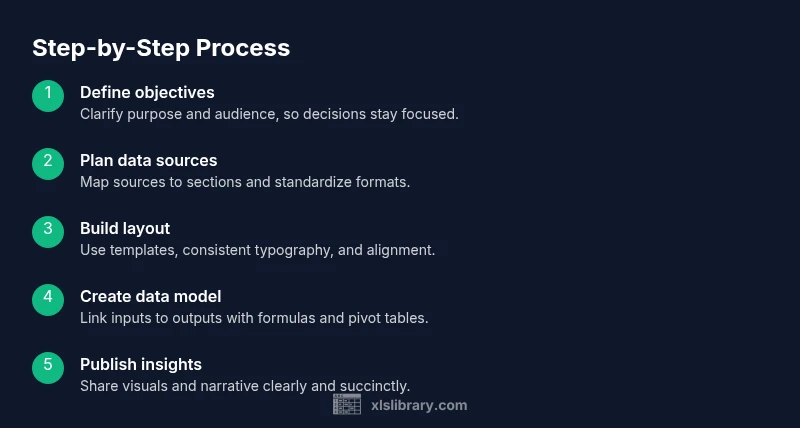
- 1
Define objective and audience
Articulate the report’s purpose, the decisions it should support, and the readers who will use it. Create a one-paragraph brief that captures goals, success metrics, and the intended narrative. This clarity guides every subsequent choice, from data selection to visuals.
Tip: Write the brief first and revisit it during edits to keep the report focused. - 2
Identify data sources and map to sections
List every data source and the fields you need. Build a data map that links sources to report sections (inputs, calculations, visuals, narrative). Establish naming conventions and data formats to reduce confusion later.
Tip: Use a single data map document or sheet to keep everyone aligned. - 3
Import and clean data
Bring data into Excel, remove duplicates, standardize dates and units, and handle missing values. Use Power Query for repeatable transformations and keep a source snapshot for auditability.
Tip: Document any decisions about defaults or imputations for future audits. - 4
Design the layout and template
Set up a reusable layout with a header, executive summary, data tables, and visuals. Apply consistent fonts, colors, and alignment to create a professional, easily scannable report.
Tip: Create a short style guide covering headings, currency, and decimals. - 5
Build data model and calculations
Connect inputs to outputs with formulas, PivotTables, or Power Pivot. Use named ranges and robust lookups (XLOOKUP) to simplify maintenance and updates.
Tip: Keep raw inputs separate from calculated outputs to simplify auditing. - 6
Create visuals and dashboards
Choose charts that tell the right story and place them for quick comprehension. Use slicers or filters to enable reader exploration without altering data.
Tip: Aim for visual consistency and avoid chart clutter. - 7
Add analysis and storytelling
Pair visuals with concise interpretations and a clear takeaway. Define 3–5 KPIs aligned with the objective and present them prominently.
Tip: Answer the reader’s core questions: what happened, why it matters, and what to do next. - 8
Automate and template for repeatability
Store templates in a central location and automate refreshes where possible. Avoid hard-coded values and document automation steps for future users.
Tip: Only automate after validating data integrity to prevent propagating errors. - 9
Validate, test, and review
Run data checks, verify visuals against source data, and gather stakeholder feedback. Maintain a QA checklist and a change log for transparency.
Tip: Invite a teammate to test the report with fresh data before final release. - 10
Share, export, and maintain
Export to PDF or publish a protected workbook. Include a brief executive summary and a last-refresh timestamp. Plan regular updates and maintain version history.
Tip: Set a publishing cadence (monthly/quarterly) to ensure consistency.
People Also Ask
What qualifies as an Excel report?
An Excel report presents data, insights, and recommendations in a structured format. It typically includes a data source, calculated metrics, visuals, and a narrative that supports decision-making. The report should be reproducible, auditable, and tailored to the audience.
An Excel report is a structured data document with charts and notes that helps decision-makers act. It should be reproducible and audience-focused.
How do I start an Excel report project?
Begin with a clear objective and audience, map data sources to sections, and set up a reusable template. Establish naming conventions and a simple data map to align team members and reduce rework.
Start with the objective, map your data, and set up a reusable template to keep everyone aligned.
What templates help speed up reporting?
Pre-built templates with a consistent layout, named ranges, and standard charts speed up production. Use a documented style guide for headings, numbers, and color schemes so each report looks and reads the same.
Templates with a consistent layout and style guide help you produce reports faster and more consistently.
Which charts are best for Excel reports?
Choose charts that match the data story: bars or columns for comparisons, line charts for trends, and pivot charts for interactive exploration. Avoid overcrowding and prioritize readability.
Use charts that clearly tell the story—like bars for comparisons and lines for trends—and keep visuals clean.
How can I automate report generation?
Automate data refreshes with Power Query and use templates to regenerate reports with new data. Document automation steps and maintain security settings to protect sensitive information.
Automate data refreshes and use templates so you can regenerate reports with new data safely.
How long does it take to learn to create good Excel reports?
Learning to create solid Excel reports is an ongoing process. Start with a simple template, then gradually add data modeling, visuals, and automation as you gain experience.
It takes time to master, but you can start with a simple template and build skills gradually.
Watch Video
The Essentials
- Define purpose before data to focus the report.
- Use templates to speed up production.
- Verify data accuracy with checks.
- Show insights with clear visuals.
- Automate repeat tasks to save time.