How to Change X Axis Values in Excel
Learn practical, proven methods to adjust the x-axis values in Excel charts, including editing data ranges, switching axis types, and handling dates for accurate visualizations.

How to change x axis values in Excel? You can update the chart’s x-axis by adjusting the underlying data range, choosing a different row or column for category labels, or configuring the axis options to use a custom label range. This quick answer leads into practical steps for both regular category axes and date or time-based axes.
Why getting the x-axis values right matters
In charts, the x-axis often conveys the timeline, categories, or sequence that the data follow. Getting these labels correct is essential for accurate interpretation: a misaligned axis can make trends look steeper, flatter, or even inverted. According to XLS Library, the axis reflects the data you provide; if the category labels don’t match the series, readers will misread the chart’s story. When you change the x-axis values, you’re not just changing labels—you’re shaping how viewers understand trends, seasonality, and comparisons across groups. This foundational step affects dashboards, reports, and presentations where quick, precise understanding is critical. In the following sections, you’ll see when to adjust the axis and how to choose between a simple category axis and a date-driven axis to match your data’s nature.
Understand your data structure: where x-axis values live
Before you alter anything, inspect where the x-axis values live in your data table. In Excel charts, the axis labels usually come from a row or a column that you designate as the category axis. If your data begins in a header row, you’ll typically use the first row or the first column as labels; if your data is a time series, dates may be in a dedicated column. Recognize whether your chart uses a numeric index, string categories, or actual dates as x-values. This awareness helps you decide whether to change the data range, adjust the axis type, or reformat the data so Excel recognizes the values correctly. Remember that formatting (text vs date) matters because Excel applies different axis rules to dates than to plain text labels.
Quick methods to change x-axis values: data range adjustment
There are several fast paths to change x-axis values without rebuilding a chart. The most common is editing the data range used by the chart. Start by selecting the chart to reveal the Chart Tools on the ribbon. Go to Design > Select Data. In the dialog, locate the Horizontal (Category) Axis Labels section and click Edit. Then select a new range for the labels from your worksheet. Confirm with OK, and Excel updates the axis accordingly. For repeatability, you can set a dynamic range by using a named range or converting your data into an Excel Table, which automatically expands the axis labels as you add rows or columns. This approach keeps the chart current with minimal maintenance.
Using the Select Data Source dialog to redefine axis labels
The Select Data Source dialog offers a centralized way to manage both series data and axis labels. After opening the dialog, you can Edit the Horizontal Axis Labels to point to a new label range. If your chart includes multiple series, you can verify that each series is still aligned with the same axis labels. When selecting a new range, ensure the number of labels matches the number of data points in each series. If misalignment occurs, Excel will adjust the plot but with mismatched categories, which defeats the purpose of the axis.
Handling date/time and non-text x-axes
Dates require special handling. If your x-axis should reflect dates, ensure the values in the source range are actual Excel date values (not text that looks like dates). In the axis options, you may choose a Date axis type, which makes Excel parse chronological order and scale properly. For non-text data, you can still use a category axis and provide date-like labels, but the axis will treat them as discrete items. If you want continuous time progression, a date axis is usually preferable. Consider formatting dates consistently and using a consistent interval (days, months) for readability.
Common pitfalls and how to avoid them
Common mistakes include selecting the wrong data range, miscounting labels, and mixing data types (dates stored as text). Always verify that the label range length matches the number of data points in your series. When you copy-paste data, Excel can shift ranges unexpectedly; use Tables or dynamic named ranges to lock the structure. If your chart suddenly displays blank labels or uneven spacing, re-check the axis labels range for extra spaces, hidden columns, or non-printable characters that disrupt alignment. Finally, remember to keep a backup before making structural changes, especially on dashboards shared with others.
Switch between category and text/date axis types
Excel supports different axis modes: a simple text/category axis for discrete labels and a date axis for chronological data. To switch, open the Axis Options panel (Format Axis) and look for Axis Type. Choose Date axis for real dates or Text/Category axis for non-date categories. This change affects how Excel spaces data points and scales the axis. If your data contains mixed types, you may need to separate them into different charts or reformat the data so the axis type stays consistent with the intended interpretation.
Best practices for charts with changing data
For charts that update frequently, use a Table (Ctrl+T) or a dynamic named range so the axis labels grow with new data automatically. Keep date formats consistent, avoid mixing numeric and text labels, and consider using a secondary axis when comparing two datasets with different units. Document your data source and any transformations, so readers understand how the axis values were derived. Regularly test charts after updates to ensure the axis continues to reflect the intended categories or dates and to prevent misinterpretation.
Troubleshooting and hands-on example
Scenario: you have a monthly sales chart, and you want to show fiscal months as the x-axis even after filtering the data. Start by selecting the chart, then Open Select Data, and edit Horizontal Axis Labels to point to the new month column. If you see a mismatch after applying a filter, convert the source data into a Table and re-create the chart or refresh the data range. Use a small, self-contained example data set to verify changes before applying them to larger dashboards. This practical exercise helps you confirm the axis behaves as expected across common editing operations.
Tools & Materials
- Computer or tablet with Excel installed(Excel 2016 or newer recommended for best compatibility)
- Sample dataset(Include a column of x-axis labels (categories or dates))
- Chart you’re modifying(A line, bar, or column chart that uses an x-axis)
- Backup copy of the workbook(Keep a version before making structural changes)
- Optional: Excel Table feature(Convert your data to a Table (Ctrl+T) for dynamic ranges)
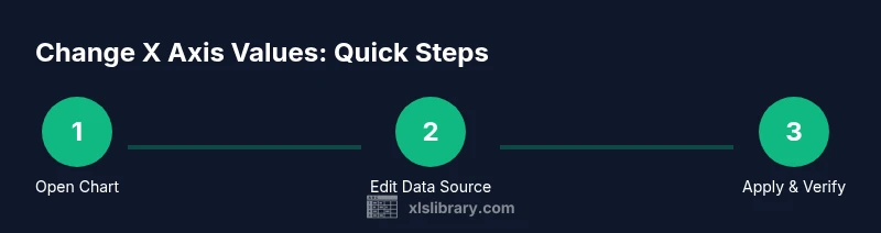
Steps
Estimated time: 15-25 minutes
- 1
Open chart and identify x-axis
Click the chart to activate Chart Tools. Locate the area where x-axis labels appear and note whether they come from a row or a column. This helps determine the best edit path and whether you should adjust the data range or axis type.
Tip: If the axis isn’t obvious, hover over the labels to see the range used by Excel. - 2
Open Select Data Source
With the chart selected, go to Design under Chart Tools and click Select Data. This dialog shows the data series and the Horizontal Axis Labels. You’ll use the Edit button to redefine the label range.
Tip: If the Edit button is dimmed, ensure the chart is properly selected and you’re using a compatible chart type. - 3
Edit Horizontal Axis Labels
Click Edit in Horizontal Axis Labels, then select the new label range on your worksheet. Confirm with OK to apply changes. Excel updates the axis immediately.
Tip: Prefer a contiguous range for clean labeling; avoid non-adjacent selections unless necessary. - 4
Consider using a Table for dynamic ranges
If you expect data to grow, convert the data range to a Table (Ctrl+T). This creates a dynamic range that expands automatically when you add rows, keeping the x-axis aligned with the data.
Tip: Tables automatically adjust charts linked to them; review axis labels after data additions. - 5
Switch between Date and Text axes if needed
Open Format Axis > Axis Options and choose Date axis for chronological data or Text axis for discrete labels. This affects scaling, tick marks, and label spacing.
Tip: Date axes often require consistent date formatting across the data source. - 6
Verify and save
Review the chart’s appearance: are labels aligned with data points? Are dates correctly ordered? Save your workbook or create a copy before sharing.
Tip: Test with filtered data to ensure the axis updates correctly.
People Also Ask
What happens if the axis labels don’t update after I change the data range?
If labels don’t update, re-check that the correct range is selected in the Horizontal Axis Labels. Sometimes Excel caches values; save the workbook, reselect the chart, and try Edit again. If you’re using a Table, ensure the table column is included in the chart’s data range.
If the axis labels don’t update, re-check the selected range and, if needed, reapply the changes by editing the axis labels again. Using a Table often prevents this issue.
Can I show dates on the x-axis as a continuous timeline?
Yes. Convert the axis to a Date axis in the Format Axis options. Ensure the source dates are real Excel dates and not text. This enables proper spacing and scaling for chronological data.
Yes. Use a Date axis in the axis options and make sure the dates are true Excel dates.
How can I keep the x-axis labels automatic as data grows?
Use an Excel Table for the source data or create a dynamic named range. Excel tables automatically expand, and charts linked to tables adjust their axis labels accordingly without manual edits.
Use an Excel Table so the axis labels grow as data grows.
What is the difference between a Date axis and a Text axis?
A Date axis treats x-values as a chronological timeline, spacing points according to actual dates. A Text axis treats labels as discrete categories, with equal spacing regardless of date gaps.
A Date axis uses real dates and shows time-based spacing; a Text axis uses label placeholders and spaces points evenly.
Do I need to rebuild a chart to change x-axis values?
Usually not. Use the Select Data Source dialog or edit the axis labels range; only recreate the chart if complex alignment issues prevent straightforward edits.
Not usually—try the Select Data Source dialog first; rebuild only if necessary.
Watch Video
The Essentials
- Update axis labels via Select Data for control over what Excel displays
- Convert to a Table to keep axis values dynamic with data growth
- Use Date axis for chronological data to preserve correct ordering
- Verify axis-label alignment after any edit