Make Chart in Excel: A Step-by-Step Guide to Charting Data
Learn how to make charts in Excel with a practical, step-by-step approach. This guide covers chart types, data prep, formatting, and tips for clear, effective visual dashboards.

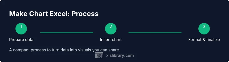
Learn how to make chart excel with a practical, step-by-step approach that covers selecting data, inserting a chart, choosing a type, and fine-tuning formatting for clarity. This quick guide gets you from raw numbers to a readable visual in minutes, with practical tips and common pitfalls to avoid.
Why charts in Excel empower data storytelling
Charts transform rows of numbers into a visual narrative. When you make chart excel, you turn static data into a story your audience can grasp at a glance. In practice, charts help you identify trends, compare categories, and communicate key insights without wading through worksheets. In this guide, you’ll learn practical steps to craft clean, accurate, and compelling charts that support decision-making. According to XLS Library, charts are fundamental tools for practical data mastery, especially for aspiring and professional Excel users who want to communicate clearly. By choosing the right chart type and ensuring your data is well-prepared, you’ll reduce confusion and increase the speed of comprehension. In addition to basics, you’ll discover how small formatting choices—colors, labels, and axis scales—can dramatically improve readability. This section sets the stage for a hands-on, approachable approach to charting that you can reuse across business, education, and personal finance scenarios. Whether you’re presenting quarterly sales, survey results, or project metrics, the ability to make chart excel with confidence is a core skill that pays off in every meeting and report.
Understanding chart types and when to use them
Excel offers a variety of chart types, each suited to different data stories. Column and bar charts are ideal for comparing categories; line charts highlight trends over time; area charts emphasize magnitude; pie charts illustrate shares of a whole; and scatter charts reveal relationships and correlations. When you plan to make chart excel, start by asking what you want the audience to learn: trend, proportion, or comparison. A quick rule of thumb is to choose line charts for time series, column charts for side-by-side comparisons, and scatter plots for relationships. Excel also provides chart recommendations that can help you pick a suitable option. Remember, the goal is clarity, not fancy visuals; a simple chart that communicates correctly is always better than a flashy one that misleads. This section also covers how to leverage chart titles, axis labels, and legends to reinforce your narrative and ensure interpretability across devices and audiences.
Preparing your data for charting
Clean data is the foundation of a trustworthy chart. Start by organizing data in a tidy table with a single header row for each column. Ensure numeric columns contain pure numbers and dates are consistently formatted. Remove blank rows or columns that could distort the chart. When you make chart excel, attach meaningful headers that describe each series and category; this helps Excel label the data automatically and makes the chart easier to understand. If your data will update over time, consider creating a dynamic named range or using Excel tables so the chart grows with the data. Finally, decide on the data range you will chart and keep a backup copy of the original dataset in case edits are needed later.
Step-by-step: create a basic chart in Excel
Creating a basic chart in Excel starts with a clear data window. First, select the data range you want to chart, including headers. Next, open the Insert tab and choose a chart type that fits your story. Then, adjust the chart elements such as title, axes, and legend to improve readability. Finally, review the data labels and scales to ensure accuracy. As you make chart excel, keep the chart minimal and avoid crowding with too many data series. If you need to compare several series, consider using a grouped column or a line chart with distinct colors. This section provides a practical blueprint you can apply to most datasets, with a focus on speed and accuracy.
Enhancing your chart with design and formatting
Once the basic chart is in place, polish it for readability and impact. Use a simple color palette with high contrast and consistent fonts. Add axis titles that clearly describe units and measures, and enable data labels only where they add value. Trim unnecessary gridlines and place the legend where it does not obscure data. If the chart will appear in a dashboard, use a uniform style across charts and align margins for a tidy layout. Consider using chart templates to standardize visuals across reports. The key is to balance aesthetics with clarity so the viewer can quickly grasp the message. When you make chart excel, small adjustments to scale, tick marks, and label formatting can significantly improve comprehension for diverse audiences.
Common pitfalls and how to avoid them
A few common chart mistakes can undermine the message you intend to convey. Avoid squeezing too many data series into one chart, which creates clutter and confusion. Don’t distort meaning by truncating axes; always show start points and ensure scales reflect the data truthfully. Refrain from using Pie charts for large categories; they are hard to read and hard to compare. Ensure data labels do not overlap and that the legend is concise. Finally, verify that the chart is linked to the correct data range, especially after data updates. These practices help maintain accuracy and trust when you make chart excel for reports, presentations, or dashboards.
Practical examples: make chart excel across scenarios
Sales performance across regions over quarters is a classic use case for a column chart with a secondary axis for growth rate. Tracking monthly website visits over a year benefits from a line chart, especially when comparing to a target line. For market share, a stacked column or a donut chart can illustrate how pieces contribute to the whole. When you want to explore relationships between two metrics, a scatter chart is the right tool. By applying these approaches, you can tailor charts to different audiences and goals, turning raw data into insightful visuals.
Tools & Materials
- Computer or device with Excel installed(Any recent version (2016+ or Microsoft 365) works well for most features.)
- Clean dataset with headers(Arrange in neat columns; each column should have a distinct header.)
- Defined data range you plan to chart(Know which rows/columns will be included in the chart.)
- Chart type decision guide(Have a general idea of whether you need a line, column, pie, or scatter chart.)
- Optional: export tools for sharing(PNG or PDF export for reports or presentations.)
Steps
Estimated time: 20-30 minutes
- 1
Select your data range
Highlight the data you want to visualize, including headers. This ensures Excel can label series automatically and makes the next steps straightforward.
Tip: Include the header row to let Excel label the series automatically. - 2
Insert the chart
Go to the Insert tab, pick a suitable chart category, then choose a specific chart style. This creates the initial chart frame you will customize.
Tip: If unsure, start with the recommended chart type shown by Excel. - 3
Choose a chart type
If the auto chart isn’t ideal, switch to a more appropriate type such as line for trends or bar for comparisons. Ensure it aligns with your story.
Tip: Avoid overusing pie charts for many categories. - 4
Format the chart elements
Add a descriptive title, axis labels, and a legend. Adjust colors and fonts to improve readability without clutter.
Tip: Keep fonts legible and colors distinct for accessibility. - 5
Refine data series and axes
Tune axis scales, units, and series colors. For large ranges, consider a secondary axis with careful interpretation.
Tip: Use secondary axes sparingly to prevent misinterpretation. - 6
Save and share the chart
Copy the chart, export as image, or embed in a report. If data will change, consider linking to a dynamic data source.
Tip: Test the chart with a mock audience to ensure clarity.
People Also Ask
What is the quickest way to make a chart in Excel?
Select your data, insert a chart, pick a type, and format. Review axis labels and the legend for clarity.
Select your data, insert a chart, choose a type, and format. Check the axis and legend for clarity.
Which chart type should I use for time series data?
Line charts are typically best for time series, as they show trend over time clearly.
Line charts work well for time series because they highlight trends.
How can I switch chart types after creating a chart?
Right-click the chart, choose Change Chart Type, and select a new type. Adjust elements as needed.
Right click the chart, pick Change Chart Type, then choose a new type.
Why isn’t my chart updating when data changes?
Ensure the chart is linked to the correct data range and that the data source is dynamic if needed.
Make sure the chart references the right data and consider dynamic ranges.
How do I export a chart as an image?
Right-click the chart and choose Save as Picture, then select PNG or JPEG format.
Right-click the chart, Save as Picture, and pick a format.
Can I use charts for dashboards?
Yes. Combine several charts with consistent formatting and use slicers or filters for interactivity.
Charts fit nicely into dashboards when visuals have consistent formatting.
Watch Video
The Essentials
- Choose the right chart type for your data story
- Prepare clean, labeled data before charting
- Format for clarity, not decoration
- Keep charts consistent for dashboards
- Verify data ranges and update behavior