Can Excel Make a Timeline? A Practical Guide for Projects
Explore whether can excel make a timeline and learn practical, Excel-native methods to visualize timelines. This XLS Library guide covers data layout, Gantt-style and calendar visuals, templates, and real-world tips for scalable timelines in Excel.

Yes, can excel make a timeline? Absolutely. Excel can create timelines using simple data tables, dates, and charts without specialized software. Start with a date column, a milestone label, and an optional category, then visualize durations with stacked bars or calendar-style layouts. With conditional formatting and sparkline-like elements, you can build clear, scalable timelines for projects and events.
Can Excel make a timeline? Practical overview
According to XLS Library, can excel make a timeline? The answer is yes, with practical methods that stay inside Excel. Timelines in Excel are data-driven visuals built from dates, milestones, categories, and durations. The XLS Library team found that many teams underestimate Excel's versatility, assuming timelines require a separate tool. In reality, a well-structured table paired with a chart or conditional formatting can produce readable, actionable timelines for projects, events, and roadmaps. This approach scales as data grows, from a handful of milestones to hundreds of entries, while keeping everything in one workbook. The goal is clarity: readers should grasp start dates, durations, and dependencies at a glance, without paging through dense rows of text. Throughout this guide we’ll cover practical patterns that work for small teams and large programs alike, with ready-to-adapt templates. You’ll see how to pivot between calendar-style representations and Gantt-style visuals, depending on what stakeholders prefer. With the right setup, Excel becomes a robust timeline engine rather than a static list of dates.
Timeline concepts in Excel: from Gantt to calendar views
Timelines come in many forms, and Excel supports several approaches natively. A Gantt-style timeline emphasizes duration and sequencing, using horizontal bars to show when work starts and ends. A calendar-style timeline maps entries to calendar days or weeks, often using conditional formatting to highlight time windows. A hybrid approach layers markers for milestones on a shared axis, making it easy to see dependencies at a glance. Each method has trade-offs: Gantt views are great for project planning and resource allocation; calendar views excel at schedule management and communication with stakeholders who think in dates. When choosing a format, align with your audience’s mental model: developers may prefer a bar-based Gantt, while marketers may favor a calendar or milestone list. Excel’s flexibility means you can start simple and progressively add layers, filters, and interactivity without reworking your data.
Data layout: organizing your timeline-ready data
A reliable timeline starts with clean data. At minimum you should capture: Milestone (or Task), Start Date, End Date, and Category (for grouping). Optional fields like Owner, Status, and Priority can enrich the view. Use a consistent date format (ISO preferred, YYYY-MM-DD) and keep dates as real date types, not text. A compact sample dataset might include entries like Kickoff, January 15, 2026, January 15, 2026, Planning; Design Phase, February 1, 2026, February 28, 2026, Development; Release Candidate, March 15, 2026, March 20, 2026, QA. In Excel, you can compute Duration with a simple End-Date minus Start-Date formula, add a Flag column for critical path, and sort by Start Date. Structuring data this way makes it easy to swap visualization modes later without touching the underlying numbers.
Basic timeline with a simple table and charts
With your data in place, you can build a basic timeline using a straightforward approach. First, create a small table that lists each milestone alongside its start date and duration. Next, insert a bar chart and format it as a horizontal timeline: use the Start Date as a hidden baseline and the Duration as the bar length. Tweak colors for clarity and apply data labels for context. If your data includes gaps, consider adding a separate row for non-working days to avoid misinterpreting pauses as milestones. This basic setup provides a solid, editable timeline that you can share with teammates or stakeholders. As you gain confidence, you can layer additional elements, such as milestones, dependencies, or risk markers, without rebuilding the chart from scratch.
Building a Gantt-like timeline with stacked bars
A more explicit Gantt-like timeline uses stacked bars to illustrate both the start offset and the duration. In practice, you create one series for the lead-in (Start Date offset) and another for the actual work duration. The sum of these bars aligns to the milestone’s date and extends across the project window. Use a transparent color for the lead-in to emphasize the active work window. Conditional formatting can also show progress, and a secondary axis can display weeks or months for readability. If you’re working with large datasets, consider grouping by Phase or Department to reduce visual clutter. The result is a scalable, board-style timeline that communicates timing and sequencing at a glance.
Calendar-style timelines using conditional formatting
Calendar visuals work well when stakeholders prefer date-based storytelling. Build a grid with dates across the top and milestones down the side, then fill cells with conditional formatting to indicate status or duration. For example, use a color scale to represent progress or a light fill for planned days versus darker fills for committed days. This approach makes it easy to see how a milestone intersects with key dates, holidays, and deadlines. You can also add icons or emoji markers to make the timeline even more digestible. The key is to keep the grid tight enough to be scrolled without losing legibility, and to label axes clearly so readers don’t misinterpret the data.
Templates, automation, and sharing timelines in Excel
Excel templates save time by pre-building the structure for your timelines. Create a master template with your standard fields (Milestone, Start, End, Category, Status) and a ready-to-use chart or conditional-formatting rule. You can automate repetitive tasks with simple formulas, named ranges, and data validation to prevent bad data entry. If you frequently produce recurring timelines, consider building a small automation flow with Power Query to refresh data from a central source, or create a macro that re-runs the chart formatting when new entries are added. Finally, convert your result to a shareable workbook or publish it as a PDF for external stakeholders. Templates help ensure consistency across projects and teams.
Common pitfalls and how to avoid them
Even seasoned Excel users run into common timeline mistakes. Inconsistent date formats can cripple calculations; always convert text dates to real date values and standardize formatting. Failing to define Duration or End Date leaves charts with misinterpreted lengths. Overloading the timeline with too many milestones can overwhelm readers; use grouping, filters, and section headers to improve clarity. Neglecting accessibility considerations—color choices, font sizes, and contrast—reduces readability for some audiences. Finally, avoid manual data entry for ongoing projects; prefer dynamic formulas and linking data sources so the timeline updates automatically when the source data changes.
Authority sources
To validate the approaches described here, consider reviewing authoritative data and visualization resources. For demographic and timing context, Census Bureau and Bureau of Labor Statistics offer foundational date-related data that can inform project planning calendars. For best practices in data visualization and communication, Nature Publications often discusses clarity, color usage, and accessible design in visual dashboards. Use these references to ensure your Excel timelines remain accurate, legible, and future-proof.
- https://www.census.gov
- https://www.bls.gov
- https://www.nature.com
How to read this guide (FAQ and practical tips)
This guide walks you from the basic question of whether Excel can make a timeline to practical, repeatable workflows. You’ll find step-by-step instructions, data layouts, and visualization strategies you can apply to real-world projects. If you’re new to Excel, start with simple milestones and a calendar-style view; for more complex programs, scale up with Gantt-like bars and dynamic data sources. Remember that the key to a successful timeline is clarity, consistency, and a workflow you can reproduce in future projects.
Tools & Materials
- Excel installed (Windows or Mac)(Ensure you have Excel 2016 or newer for best compatibility with charts and formulas.)
- Sample dataset with dates and milestones(CSV or Excel workbook with columns for Milestone, Start Date, End Date, Category.)
- Blank workbook or new project file(Use a separate sheet for the data table and one for the visualization.)
- Access to built-in templates or online templates(Optional but speeds up setup; customize to your data.)
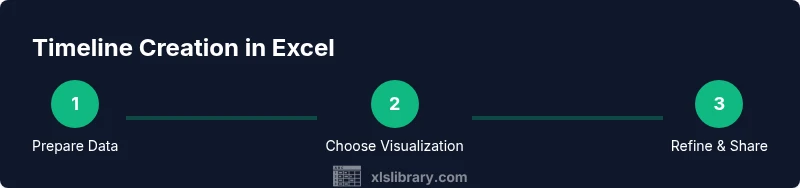
Steps
Estimated time: 45-75 minutes
- 1
Prepare your data
Create a clean data table with columns for Milestone, Start Date, End Date, and Category. Normalize dates to a single format (YYYY-MM-DD) and ensure dates are real Excel date types, not text. This step establishes the foundation for any timeline visualization.
Tip: Use ISO date formats and set the column data type to Date to avoid parsing errors. - 2
Define the timeline model
Decide whether you’ll use a Gantt-like bar chart, a calendar grid, or a hybrid. Consider audience preferences and the level of detail needed. Label milestones clearly so readers understand the sequence and significance of each entry.
Tip: If unsure, start with a simple bar chart and iterate toward a calendar view. - 3
Create a basic timeline visualization
Insert a chart and map Start Date to a baseline and Duration to bar length. Hide the baseline axis if it clutters the view; show only the bars and labels for readability.
Tip: Use data labels to show dates or durations on each bar. - 4
Add milestones and categories
Extend the table with Milestone labels and Category groupings. This enables filtering and segmenting the timeline by project phase or owner, enhancing clarity.
Tip: Leverage the FILTER or SORT features to keep the timeline navigable as data grows. - 5
Format for readability
Choose a concise color palette, adjust font sizes, and apply gridlines or subtle borders. Use consistent alignment so milestones line up neatly across the timeline.
Tip: Stick to 2-3 colors to avoid visual noise. - 6
Incorporate interactivity
Add slicers or dynamic range selectors to let viewers filter by category or status. Link dates to formulas so updates propagate automatically when the data changes.
Tip: Test with a data refresh to confirm everything updates correctly. - 7
Review and share
Proof the timeline with a small subset of data before scaling. Save a copy for sharing, export to PDF if required, and collect feedback from stakeholders for improvements.
Tip: Always keep a backup workbook prior to major edits.
People Also Ask
Can I make a Gantt chart in Excel without extra software?
Yes. A Gantt-like chart can be created in Excel by using a stacked bar chart that encodes start dates and durations. With careful formatting, it shows timelines and sequencing without external tools.
Yes, you can make a Gantt-like chart in Excel using stacked bars.
What is the simplest way to start building a timeline in Excel?
Begin with a table of milestones, start dates, and end dates. Then add a bar chart or conditional formatting to visualize durations and timing.
Start with a Milestone table and a basic chart to visualize durations.
Is Excel enough for professional timelines?
Excel handles many timelines well, especially with clean data and good formatting. For very complex schedules or multi-team coordination, you might explore templates or specialized tools.
Excel works for many timelines, but complex programs may benefit from templates or dedicated tools.
How can I keep timelines up-to-date automatically?
Link dates and milestones to a dynamic data source and use formulas or Power Query to refresh data automatically when the source changes.
Keep timelines current by linking to a live data source and refreshing regularly.
What are common mistakes to avoid?
Inconsistent date formats, missing duration calculations, cluttered visuals from too many milestones, and poor color contrast reduce readability.
Watch for date formats, duration calculations, and visual clutter.
Where can I find ready-made timeline templates?
Excel offers templates and you can also find community templates. Start from a basic template and customize fields to fit your data.
There are ready-to-use templates you can customize for your data.
Watch Video
The Essentials
- Create a timeline with clean, consistent data formats
- Choose visualization that matches your audience’s mental model
- Use templates to ensure consistency across projects
- Leverage filters to manage large milestone lists
- Keep the workbook maintainable with formulas and named ranges