How to Make a Gantt Chart in Excel
Learn to create a clear Gantt chart in Excel using simple data, stacked bars, and optional formatting. This practical XLS Library guide covers setup, customization, and maintenance for reliable project timelines.

In this guide, you will learn how to make a Gantt chart in Excel from scratch using a simple task list, start dates, and durations. You’ll choose a visualization method, set up the data correctly, and apply formatting that makes timelines easy to read. This practical approach covers two reliable methods—stacked bar charts and conditional formatting—and includes step-by-step actions to build a repeatable template.
What you’ll build with this guide
This guide shows how to create a practical Gantt chart in Excel that helps you visualize tasks, start dates, durations, and progress. By the end, you’ll be able to present timelines clearly, adjust schedules quickly, and keep stakeholders aligned. According to XLS Library, a well-structured Gantt chart in Excel makes project timelines more actionable and easier to track. The XLS Library team found that practitioners who start with a simple data table and choose a reliable visualization approach can reproduce accurate charts across projects. This article emphasizes repeatability and clarity so you can reuse templates for future work and scale your charts as projects grow. You’ll learn two solid methods and a straightforward data workflow that works for small teams or larger programs. The techniques apply to both Excel on Windows and
Data structure you need
To build a Gantt chart in Excel, start from a clean data table. A minimal structure includes: Task Name, Start Date, and Duration (in days). If you want to display End Date instead of Duration, you can compute it with a simple formula. Optional columns like Responsible Person, Status, or Dependency can help with project tracking. Keep dates as proper Excel date values, not text. For readability, sort tasks by phase or priority. If you anticipate changing durations, consider setting up a “Duration” column that can be easily edited without altering other fields. A compact, well-labeled table is the backbone of a reliable Gantt chart, so invest a few minutes to standardize formats before you chart.
Method A: Stacked Bar Chart (simple approach)
The stacked bar chart method uses a base “Start Offset” column and a visible “Duration” column. Start with a table that lists each task, its start date, and its duration (in days). Add a helper column that computes the offset from the project start date, then insert a stacked bar chart. Format the Start Offset series to be invisible and format the Duration series with your chosen color. Adjust the horizontal axis to show dates accurately and ensure the bars align with the correct tasks. This approach yields a classic Gantt appearance with minimal steps and is ideal for quickly visualizing timelines.
Method B: Conditional Formatting Gantt (no chart)
If you prefer not to use a chart object, build a grid where dates run across the top and tasks run down the side. Each cell represents a date for a task. Apply a conditional formatting rule that fills a cell when the date falls within the task’s start and end window. The formula typically checks if the date is between StartDate and StartDate + Duration. This method is lightweight, easy to update, and works well in environments where you want a printable table view alongside the chart.
Adding Dependencies and Progress (optional)
For more complex projects, add a Dependency column to capture predecessor tasks. You can use simple text like “Task 1” or build a small lookup to reflect relationships. To track progress, include a Progress (%) column and optionally shade the corresponding portion of the bar or grid to reflect completion. These additions help teams monitor blockers and adjust schedules in real time without rewriting data.
Dynamic updates with formulas
Use dynamic formulas to keep your Gantt chart current as dates shift. For example, use VLOOKUP or INDEX-MATCH to pull Start Dates and Durations from a master table, and compute End Dates with Start Date + Duration. If you’re using the stacked bar method, convert date values into a numeric offset to maintain alignment as you update the project timeline. These dynamic elements reduce manual edits and improve reliability.
Customization for readability
Choose a color palette with high contrast and use bold borders to separate tasks. Label bars with task names, and consider a light grid background to improve readability. You can also add minor gridlines, change the date axis formatting, and freeze panes so headers stay visible while scrolling. Consistency in fonts and alignment helps stakeholders quickly interpret the chart during meetings.
Common issues and fixes
Date formatting errors, misaligned axes, or invisible bars are common pitfalls. Verify your date fields are true Excel dates, not text. If the axis ignores values, check the minimum and maximum date settings and adjust the scale. For stacked bars, ensure the Start Offset is truly invisible (no fill), or readers may misinterpret the baseline. Regularly test with a small sample to catch issues early.
Sharing, templating, and maintenance
Save your Gantt chart as a template for future projects to ensure consistency. Share the workbook with your team and embed the chart into a project dashboard for stakeholders. Document assumptions (start dates, durations) so future editors understand the logic. A well-maintained template reduces setup time and keeps your project management practices aligned across initiatives.
Tools & Materials
- Microsoft Excel (Windows or macOS, 2019+ or 365)(Ensure you have a version with bar charts and conditional formatting options.)
- Sample dataset (Task, Start Date, Duration)(Create a small, labeled table to practice the charting workflow.)
- Optional prebuilt Gantt template(Speeds up learning and demonstration.)
- Accessible color palette(Choose colors with good contrast and color-blind friendly options.)
- Printer or PDF export setup(Useful for sharing static charts with stakeholders.)
Steps
Estimated time: 60-90 minutes
- 1
Prepare your data
Create a table with columns for Task, Start Date, and Duration (in days). Add optional columns for End Date, Dependency, and Progress. Ensure Start Date uses Excel date values and keep formatting consistent for easier calculations.
Tip: Keep the project start date in a single cell to simplify the Start Offset calculations. - 2
Create a Start Offset helper
If using the stacked bar method, add a Start Offset column defined as Start Date minus Project Start Date. This creates the invisible baseline for each task.
Tip: Format the Start Offset series with no fill so the bars appear as shifts rather than separate bars. - 3
Insert a stacked bar chart
Select Task, Start Offset, and Duration. Insert a stacked bar chart, then arrange the data so Start Offset forms the invisible base and Duration forms the visible Gantt bar.
Tip: Position the chart next to the task list for easy cross-reference. - 4
Hide the Start Offset and adjust axis
Format the Start Offset series to have no fill and no border. Format the horizontal axis to display dates that align with your project timeline.
Tip: Set the minimum date to your project start to keep bars aligned. - 5
Label tasks and format bars
Add data labels if needed and adjust bar colors for readability. Use bold fonts for task names and keep a consistent bar height.
Tip: Avoid overly bright colors that distract from the data. - 6
Alternative: apply conditional formatting (grid method)
Create a date grid with tasks down the side and dates across the top. Use a formula like IF(AND(Date>=StartDate, Date<StartDate+Duration), Color, NoColor) for cell shading.
Tip: This method is great for printable reports. - 7
Incorporate progress and dependencies
Add a Progress column and optional Dependency column to show blockers and completion. Use lighter shading to indicate ongoing work.
Tip: Document assumptions about dependencies to prevent misinterpretation. - 8
Refine the chart for sharing
Tidy up labels, adjust font sizes, and ensure axis scales are readable on both screen and print. Save as template for reuse.
Tip: Test on a second screen or projector to verify readability. - 9
Maintain and update
Update Start Dates and Durations as the project evolves. Ensure the chart remains a live reflection of the schedule.
Tip: Establish a recurring review to keep the Gantt chart accurate.
People Also Ask
Do I need the latest version of Excel to make a Gantt chart?
You can create Gantt charts in most recent versions of Excel, including Office 2019 and Excel for Microsoft 365. Some features like advanced chart formatting are easier in newer builds, but the core methods—stacked bars or conditional formatting—work across versions.
You can use recent versions like Office 2019 or 365; newer builds make formatting easier, but the basics still work in many editions.
What data do I need to start a Gantt chart in Excel?
Start with a task list, a start date for each task, and a duration in days. Optional fields like End Date, Dependency, and Progress help add context but aren’t required for a basic chart.
All you need to begin is a task list, start dates, and durations. Optional fields add clarity.
Can I create a Gantt chart without using macros?
Yes. You can create Gantt charts using standard charts or conditional formatting without macros. Macros are only needed if you want heavy automation or custom features beyond the basics.
No macros are required for a standard Gantt chart in Excel.
How do I update progress on the Gantt chart?
Add a Progress column and update the percentage complete. You can reflect progress visually by shading or by adjusting the bar length in the Duration portion if you want a dynamic effect.
Add a progress column and keep it up to date; your bars will reflect completion.
What are best practices for colors and labels?
Use a consistent, accessible color palette with high contrast. Label tasks clearly and avoid overcrowding the chart. Keep axis labels legible and align fonts with your project dashboard.
Keep colors consistent and labels clear so the chart is easy to read.
How can I share the Gantt chart with my team?
Save the workbook as a template or export the chart to PDF for distribution. Include a short legend and a notes section to explain assumptions and data sources.
Share a template or PDF of the chart along with a legend and notes.
Watch Video
The Essentials
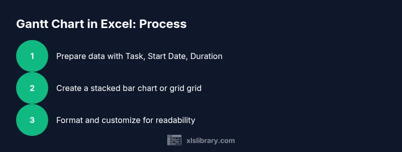
- Plan data structure before charting
- Choose a clear visualization method (stacked bar or grid)
- Keep formatting consistent for readability
- Maintain the chart with a routine update
- Reuse templates to scale your workflows