Combo Chart Excel: A Practical Guide to Dual-Scale Visuals
Learn how to create and customize a combo chart in Excel that blends a column and a line to compare two data series with different scales. Step-by-step guidance, best practices, and templates from XLS Library.

This guide shows you how to create a combo chart in Excel that combines a column series with a line series to compare two data sets on different scales. You’ll learn when a combo chart is appropriate, how to assign chart types to each series, how to add a secondary axis, and how to format for readability. Follow the step-by-step approach and practical tips from XLS Library to produce a clean, dashboard-ready visualization.
What is a combo chart in Excel?
According to XLS Library, a combo chart in Excel is a single chart that uses more than one chart type for different data series, typically a column for one metric and a line for another. This approach helps users compare absolute values and trends within a single visualization. It’s especially useful when the two series have different scales or units, so you don’t have to force one series onto a shared axis that distorts the data. By combining chart types, you can highlight relationships between metrics while preserving the clarity of each series. This section lays the groundwork for how combo charts can illuminate patterns that a single chart type might obscure.
- Benefits at-a-glance: clear comparison, scalable visuals, easier trend spotting.
- Common use cases: sales vs. growth rate, budget vs. actuals, temperature vs. energy usage.
Note from XLS Library: Mastery comes from practicing with real data and templates. This helps you judge when a secondary axis improves clarity without causing confusion.
When to use a combo chart
A combo chart is particularly useful when you need to compare two metrics that differ in scale or unit. For example, you might show monthly sales (in dollars) as a column and a monthly growth rate (in percent) as a line. Using a secondary axis for the growth rate prevents the line from being dwarfed by large sales figures while keeping both series readable on the same chart. Another scenario is tracking a large absolute value alongside a smaller index value to reveal relative performance. In dashboards, combo charts provide a quick, side-by-side view of how two related metrics interact over time. Always consider whether a single chart type communicates the relationship clearly or if a combo approach will reduce cognitive load for the viewer.
- Signals that a combo chart is appropriate: distinct scales, clear interaction between metrics, need for quick comparison.
- Signals that a single chart type may suffice: similar scales, straightforward values, minimal viewers.
Types of combo charts you can create
Excel supports several effective combo configurations. The most common is a Column + Line combo with a secondary axis for the line. You can also mix Bar with Line, or Area with Line, depending on how you want to emphasize magnitude versus trend. For readability, reserve a single secondary axis per chart and ensure color contrast differentiates the series. If you combine too many chart types, you risk clutter and confusion. Test different configurations using your data to see which layout communicates the message most efficiently.
- Standard combo: Columns for one metric, a line for another, with a secondary axis for the line.
- Alternative combos: Bars with a line, or an area chart paired with a line for emphasis on trend.
- Best practices: limit to two primary data series, maintain consistent color-family mapping, and avoid overlapping data labels.
Step-by-step: create a combo chart
To build a combo chart in Excel, start by selecting your dataset and inserting a chart, then switch one series to a different chart type. In practice, you’ll first create a base chart, then customize each series. The next block provides a precise, actionable sequence you can follow in your workbook. This narrative complements the step-by-step section that follows, giving you context for decisions about axis placement, labeling, and formatting.
- Start with your data grid: ensure clean headers and numeric values.
- Insert a base chart: choose a default Column chart to establish the primary visual.
- Change the second series: set the second data series to a Line chart.
- Enable a secondary axis: assign the line series to a secondary axis if scales differ.
- Fine-tune layout: adjust axis titles, legend, and data labels for clarity.
Customize axes and formatting
After you’ve established the basic combo chart, focus on readability. Use a secondary axis for the non-primary series and ensure axis labels are aligned with the corresponding data. Choose colors with high contrast and avoid similar hues that confuse viewers. Add or adjust data labels selectively to avoid clutter, and consider a clean legend placement—typically on the right or bottom. Ensure the axis scale is appropriate for both series: too wide a range can flatten meaningful trends, while too narrow a range can exaggerate minor fluctuations. In many cases, a logarithmic scale can help when data spans several orders of magnitude, but use it only if it makes the trend clearer.
Practical examples: sales vs. seasonality
Consider a sales dashboard where monthly revenue (in dollars) is shown as bars and a seasonality index (0–100) is drawn as a line. The secondary axis allows viewers to compare the magnitude of revenue with seasonal fluctuations without distorting either metric. Another example is heat-related energy usage: total energy (kWh) as bars with temperature as a line. In both cases, a well-designed combo chart communicates correlation: spikes in revenue or energy usage often align with seasonal peaks. Use annotations to highlight notable events (promotions, weather anomalies) and keep the visual language consistent across reports.
Common pitfalls and how to avoid them
Combo charts are powerful when used correctly, but a few pitfalls can undermine their effectiveness. Avoid injecting too many data series into a single chart, which creates visual clutter. Don’t pair trends with similar magnitudes that don’t require a secondary axis; if the secondary axis isn’t necessary, a single-axis combo may be cleaner. Overusing data labels can overwhelm the viewer; prefer axis labels and a concise legend. Finally, be mindful of accessibility: ensure color contrast is sufficient for colorblind viewers and provide alt text if the chart will appear in documentation or dashboards.
Advanced tips: using secondary axis, data labels, and formatting
When used sparingly, a secondary axis substantially improves readability. Place the secondary axis on the side with a clear, distinct scale and label it explicitly to avoid misinterpretation. For data labels, apply them to a subset of data points (e.g., every 3rd point or only peak values) to reduce clutter. Use consistent fonts and line thickness, and consider subtle gridlines to help readers gauge values without distraction. If you must adjust data ranges, test the impact by comparing the chart against the raw data to ensure the visual remains truthful to the underlying numbers.
Real-world scenarios: dashboards and reports
In real-world dashboards, combo charts consolidate two related but differently scaled metrics into a single, glanceable visualization. They are especially valuable in executive dashboards, quarterly reviews, and performance scorecards where stakeholders want to see relationships at a high level. To maximize impact, pair combo charts with other visual elements like sparklines, small multiples, or KPI tiles for context. Always validate the chart with a sample audience and gather feedback on readability, color usage, and axis labeling. By aligning the chart with the overall storytelling of the report, you turn raw numbers into actionable insights.
Tools & Materials
- Excel desktop or Excel Online(Any recent version (Excel 2016+ recommended) with charting features.)
- Data set with at least two numeric series(Ensure a common category axis (time, product, region) and two quantitative series.)
- Template workbook (optional)(Use a pre-built example to practice combo charts.)
- Color palette and fonts(Choose high-contrast colors and readable fonts for dashboards.)
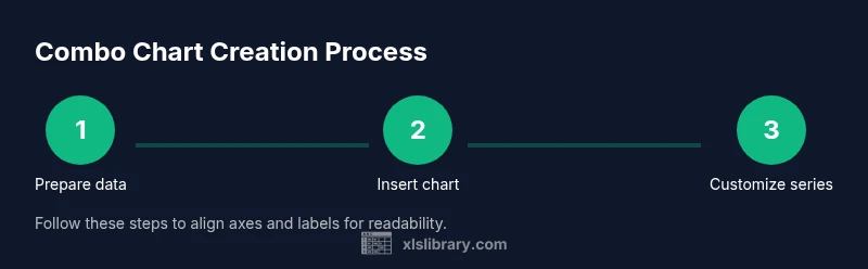
Steps
Estimated time: 15-25 minutes
- 1
Prepare your data
Organize data with a clear header row. Put the category axis in the leftmost column and place each data series in its own column. Ensure all values are numeric and free of stray characters or blanks that could disrupt charting.
Tip: Keep data in a single table to simplify selection later. - 2
Insert a base chart
Select the data range and insert a default Column chart. This establishes the primary data series visually and gives you a baseline to modify for the combo configuration.
Tip: Use the Insert tab > Recommended Charts as a quick starting point. - 3
Add the second series
If Excel didn’t automatically include the second series, add it by selecting the chart, choosing Design > Select Data, and adding the second series name and values.
Tip: Name the series clearly to avoid confusion in the legend. - 4
Change the second series to a different chart type
Open the Format Data Series pane and set the second series to Line (or another type you want). This is the core of the combo chart.
Tip: Aim for a prominent, readable line that contrasts with the bars. - 5
Enable a secondary axis
If the two series use different scales, assign the secondary axis to the second series (Format Data Series > Plot Series On > Secondary Axis).
Tip: Only use a secondary axis when the scales truly differ. - 6
Format axes and labels
Add axis titles, adjust tick marks, and ensure the legend is visible but not dominating. Consider minor gridlines for reference without clutter.
Tip: Use concise axis titles to maintain clarity. - 7
Add data labels selectively
If needed, add data labels for key points rather than every point. This keeps the chart readable while conveying precise values.
Tip: Label peaks and important milestones only. - 8
Review and finalize
Check alignment, ensure color consistency, test with another data subset, and adjust spacing to fit your dashboard layout.
Tip: Preview the chart at the intended display size (projector, report, or screen).
People Also Ask
What is a combo chart in Excel?
A combo chart in Excel uses two or more chart types in one chart to display different data series. This is especially useful when the series have different scales or units. The format lets you compare magnitude and trend side by side without sacrificing readability.
A combo chart uses different chart types in one chart to compare data series with different scales.
When should I use a combo chart?
Use a combo chart when you need to compare two related metrics that don’t share the same scale, such as revenue and growth rate, or temperature and energy use. It helps viewers understand relationships at a glance.
Use it when two metrics have different scales but are related in time or category.
How do I add a secondary axis?
Select the data series you want on the secondary axis, go to Format Data Series, and choose Secondary Axis. This separates scales to improve readability.
Put the second data series on the secondary axis to keep both series visible.
Can I use combo charts in Excel Online?
Yes. Excel Online supports creating and editing combo charts, though some advanced formatting options may be limited compared to the desktop version.
Yes, you can create combo charts in Excel Online, with some features limited.
What are best practices for labeling a combo chart?
Keep axis titles concise, use a descriptive legend, and avoid excessive data labels. Color contrast should be strong, and the chart should tell a clear story at a glance.
Name the axes clearly, keep the legend simple, and use colors that contrast well.
Is there a template to practice with?
Yes. Start with a template workbook that includes two data series and a monthly category axis. Practice mapping the series to different chart types and adjusting the axis.
Use a ready-made template to practice mapping series to different chart types.
Watch Video
The Essentials
- Combine chart types to reveal relationships between metrics
- Use a secondary axis only when scales necessitate it
- Keep visuals clean with selective data labels and clear legends
- Test with real data and preview for the intended display
- Practice with templates from XLS Library to build confidence