Excel 360: Practical Guide to Data Mastery
Master practical data workflows in Excel 360 with this step-by-step guide. Learn data cleaning, modeling, and dashboards with tips from XLS Library.

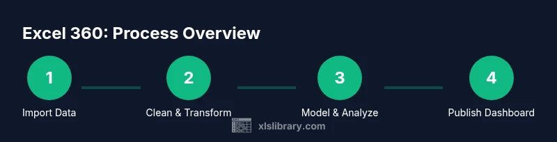
Excel 360 empowers you to turn raw data into actionable insights through practical, step-by-step techniques. This guide covers data import and cleaning, data modeling with relationships, pivot tables, dashboards, and visualization. You’ll gain repeatable workflows you can apply to real projects, delivering accurate results faster and with less manual effort.
What Excel 360 delivers for data mastery
According to XLS Library, Excel 360 is not just a spreadsheet app; it's a platform for practical data mastery. It brings together data import, cleaning, modeling, and visualization into a cohesive workflow. In this guide, you’ll learn how to turn messy data into reliable insights by using Power Query to shape data, Power Pivot to model relationships, and modern formulas to automate calculations. You will practice building scalable dashboards that communicate results clearly to stakeholders. By following these steps, you’ll gain confidence in managing real-world data tasks, from monthly sales reports to operational dashboards. Throughout, you’ll see how the 360 suite enhances collaboration and version control, enabling teams to refresh dashboards with new data without recreating analyses. The focus is on repeatable workflows, not one-off hacks, so you can apply what you learn to varying data scenarios and industries.
Core workstreams you’ll master in Excel 360
Excel 360 organizes your skills into core workstreams that compound into powerful analyses. The idea is not to memorize isolated tricks, but to develop repeatable routines you can adapt to different data problems. The first workstream is data acquisition and cleansing: you connect sources, filter noise, and structure data in clean tables. The second workstream is data modeling: you build relationships between tables, create a data model, and ensure referential integrity so calculations remain accurate as the dataset grows. The third workstream focuses on calculation and automation: you craft robust formulas using LET, XLOOKUP, FILTER, and dynamic arrays, then convert them into reusable measures or named ranges. The fourth stream is visualization: pivot tables, charts, sparklines, and conditional formatting that tell a story at a glance. Finally, the governance workstream covers version control, templates, and documentation to keep analyses auditable and shareable across teams.
Importing data from multiple sources
A core strength of Excel 360 is seamless data ingestion. You can connect to CSV files, databases, web data, and cloud services using Get Data and the Power Query editor. Set up connectors once, then refresh with a single click. This approach keeps data sources centralized and ensures consistency across reports. For ongoing projects, maintain a data source map that records where each dataset originates, what permissions are required, and how often it updates.
Tip: Prefer native connectors over manual exports to minimize drift between sources and your workbook.
Cleaning and transforming data with Power Query
Power Query is your friend for reliable data cleaning. Start by removing duplicates, fixing data types, and normalizing text formats. Apply stepwise transformations so you can audit every change later. Use conditional columns to standardize values and pivot/unpivot data when needed to match your model. The goal is a clean, tabular structure that supports repeatable analysis, not a one-off hack. Save transformation steps as a reusable query so future imports automatically follow the same cleaning rules.
Pro-tip: Always validate a sample of transformed data against the original to catch edge cases early.
Data modeling: relationships and data integrity
With a clean data foundation, load tables into a data model and define relationships that reflect real-world structures. A well-designed model uses primary keys and foreign keys to link facts (sales, orders) to dimensions (customers, products, time). This setup enables accurate aggregations and scalable analytics as data grows. Use descriptive names for tables and relationships, and document the model schema for teammates. A robust model reduces the risk of circular references and duplication in reports.
Note: Keep cardinality and cross-filter directions consistent to avoid ambiguous results.
Calculations: formulas and functions that scale
Excel 360 shines with powerful, scalable calculations. Use LET to name intermediate results, XLOOKUP or VLOOKUP for lookups, and FILTER to create dynamic subsets. Leverage dynamic arrays to spill results automatically into adjacent cells, reducing complex array formulas. Design calculations to be reusable—convert repeated logic into named ranges or measures in the data model. Build error handling into formulas so dashboards gracefully show missing or unexpected data rather than breaking.
Tip: Test formulas across different data slices to ensure resilience.
Pivot tables and advanced visualizations
Pivot tables are your primary tool for exploratory analysis and fast summarization. Connect pivots to the data model to automatically reflect changes in underlying data. Add slicers and conditional formatting to make insights stand out and interactive. Move beyond basic charts by pairing charts with dashboards that use consistent color schemes, axis labeling, and data labels. Remember, the best visuals reveal insights at a glance, not require interpretation.
Building a responsive, informative dashboard
A dashboard should tell a story: what happened, why it happened, and what to do about it. Start with a clean grid, align visuals, and place the most important KPI cards in a prominent position. Use slicers for interactivity, ensure consistent formatting, and validate the data sources underpinning every chart. Test the dashboard on different screen sizes to ensure readability and adjust font sizes and spacing accordingly. The goal is a single view that supports quick decisions, not a wall of charts.
Automation and governance: templates, naming, versioning
Automation comes from templates, standardized naming, and disciplined version control. Create workbook templates that include your data model, common calculations, and a starter dashboard. Use a consistent naming convention for tables, queries, and measures so teammates can locate components quickly. Document major changes and maintain a changelog to support auditability. Periodically review dashboards to prune outdated visuals and refresh data sources.
Real-world example: sales performance dashboard walkthrough
In a practical sales dashboard, you import quarterly data, clean it, and model it with a product and region dimension. A single dashboard then shows total sales by region, top products, and a trend line over time. Interactivity comes from slicers for quarter and product category, which filter all visuals in real time. The XLS Library analysis shows that teams adopting this approach can produce coherent dashboards with fewer revisions and clearer insights. The example demonstrates practical value for everyday business decisions and team collaboration.
Tools & Materials
- Computer with Excel 360 installed(Windows 10/11 or macOS with latest updates)
- Stable internet connection(Needed for data sources, updates, and online help)
- Sample Excel workbook (data set)(Include tables for practice and testing)
- Notepad or documentation tool(Optional for jotting steps and decisions)
- External data sources (CSV, JSON, or web data)(Optional for practice with real feeds)
Steps
Estimated time: 3-5 hours
- 1
Prepare your workspace
Open Excel 360 and load the sample workbook. Enable the Data tab, turn on necessary add-ins, and arrange windows for easy reference. Confirm your system has adequate RAM for data operations.
Tip: Close nonessential apps to maximize performance. - 2
Connect and import data sources
Use Data > Get Data to connect to CSV files, databases, or web data. Choose stable sources and define refresh frequency for reproducibility.
Tip: Prefer built-in connectors over manual data copies to avoid drift. - 3
Clean and transform data
Launch Power Query, remove duplicates, fix data types, and standardize formats. Apply transformations in a repeatable sequence and preview results before loading.
Tip: Document each transformation step for traceability. - 4
Create a data model
Load cleaned tables into the data model and define primary/foreign keys to link facts to dimensions. Check for referential integrity and naming consistency.
Tip: Name relationships clearly to avoid confusion later. - 5
Add calculations and measures
Create robust calculations using LET, XLOOKUP, and FILTER. Convert repeated logic into measures or named ranges for reuse.
Tip: Test calculations across multiple data slices. - 6
Build a pivot table
Create a pivot table from the data model, add fields, and set up initial aggregations. Include slicers to enable interactivity.
Tip: Use pivot table styles that improve readability. - 7
Design visuals and charts
Add charts that best illustrate trends and comparisons. Keep color palettes accessible and consistent with the dashboard theme.
Tip: Avoid clutter by limiting chart types to 2–3 per view. - 8
Assemble the dashboard
Arrange visuals on a dashboard sheet with a clear hierarchy. Use alignment guides and consistent fonts for a professional look.
Tip: Preview on a smaller screen to ensure readability. - 9
Add interactivity with slicers
Link slicers to the data model so filters apply across visuals. Validate cross-filter directions to prevent unexpected results.
Tip: Test all filter combinations before sharing. - 10
Document and save templates
Create a quick-start guide, save the workbook as a template, and establish a refresh cadence. Share the template with teammates for consistency.
Tip: Maintain a brief changelog for major updates.
People Also Ask
What is Excel 360?
Excel 360 is the current edition of Excel available through Microsoft 365, offering enhanced data tools like Power Query, Power Pivot, and advanced analytics features.
Excel 360 is the current Excel in Microsoft 365 with enhanced data tools.
Do I need Microsoft 365 to use Excel 360?
Excel 360 is part of Microsoft 365, but some features may be available in standalone Excel versions. For full Power Query and data modeling capabilities, Microsoft 365 is recommended.
Power Query and data modeling are best with Microsoft 365.
Can I use Excel 360 on a Mac?
Yes, Excel 360 runs on macOS, though some features or add-ins may differ slightly from Windows versions. Power Query and PivotTable functionality are generally available on Mac.
Excel 360 works on Mac with mostly the same features.
What are Power Query and Power Pivot?
Power Query handles data import and transformation; Power Pivot builds data models and relationships for complex analyses. They are core components of Excel 360 for scalable analytics.
Power Query imports and cleans data; Power Pivot models it for analysis.
How do I refresh dashboards with new data?
Maintain data connections and set up scheduled or on-demand refreshes. Ensure the data model and queries are updated so visuals reflect the latest information.
Refresh connections to keep dashboards up to date.
Is Excel 360 suitable for beginners?
Yes, but expect a learning curve. Start with basics like cleaning data and simple pivots, then gradually add Power Query and modeling concepts.
Beginner friendly with a progressive learning path.
Watch Video
The Essentials
- Define a repeatable data workflow
- Model data with clear relationships
- Build dashboards that tell a story
- Automate with templates and governance