Regression Analysis in Excel: A Practical Guide
Learn how to perform regression analysis in Excel, from data prep to interpreting outputs, using the Analysis Toolpak, LINEST, and visualizations to communicate results confidently.

You will perform a regression analysis in Excel to model a dependent variable from one or more predictors, using Data Analysis Toolpak or LINEST, and interpret key outputs. The process includes preparing data, selecting the right model, checking assumptions, validating results, and communicating findings clearly. This quick answer sets the stage for the in-depth steps that follow.
What regression analysis in Excel can do
Regression analysis in Excel is a powerful, accessible way to quantify relationships between a dependent variable and one or more independent predictors. By fitting a line or a plane to data, you can estimate how changes in the predictors affect the outcome, gauge the strength of the relationship, and forecast future values. In practical terms, this means you can answer questions like: how much does ad spend impact sales, or how do temperature and humidity influence production yield? For XLS Library readers, mastering regression analysis in Excel unlocks a data-driven approach without needing specialized software. Expect to interpret coefficients, R-squared, and p-values, and to communicate results with clear visuals and concise summaries.
Setting up your data for regression
A solid regression starts with clean, well-structured data. Ensure each observation is a row, with one column for the dependent variable (the outcome you want to predict) and additional columns for each predictor (the variables that help predict the outcome). Remove non-numeric values from predictor columns, handle missing data thoughtfully (e.g., imputation or row exclusion), and name columns descriptively to avoid confusion later. Consistency matters: numeric formatting should be uniform, dates should be converted to numeric representations if used as predictors, and outliers should be reviewed rather than automatically discarded. In Excel, you’ll often work with the Data Analysis Toolpak or the LINEST function after this prep.
Choosing the right model: simple vs multiple regression
A simple regression uses one predictor, ideal when you want a quick sense of the relationship. Multiple regression includes two or more predictors and can reveal more nuanced influences, but it also introduces potential pitfalls like multicollinearity. Decide based on theoretical justification and data quality. If you have a small dataset, start with simple regression to establish baseline behavior; if theory and data permit, extend to multiple regression while monitoring diagnostics such as tolerance or VIF (variance inflation factor) to detect correlated predictors.
Using the Data Analysis Toolpak
The Data Analysis Toolpak provides a guided path to regression analysis in Excel. First, enable the add-in, then choose Regression from the Analysis Tools. Select the Y Range (dependent variable) and the X Range (predictors). Check labels if your first row has headers, choose an output range, and decide whether to include residuals and confidence intervals. Run the tool and review the summary output to identify the intercept, coefficients, R-squared, adjusted R-squared, and p-values for each predictor. This workflow yields reproducible results suitable for reporting and decision-making.
Interpreting the regression output
Key outputs include the regression equation (a = intercept; b1, b2, ... = coefficients), R-squared (explained variance), and p-values (statistical significance of each predictor). A high R-squared indicates the model explains a large portion of the variation in the dependent variable, but it is not a guarantee of causation. Coefficients tell you the expected change in the dependent variable per unit change in the predictor, holding other predictors constant. The F-statistic tests whether the model fits better than a simple mean model. Always check residuals for patterns that might suggest model misspecification or nonlinearity.
Using LINEST for advanced users
LINEST provides a more flexible, matrix-based approach to regression, supporting multiple predictors and advanced statistics not always exposed in the Toolpak interface. When using LINEST, enter it as an array formula and include options for statistics. The output includes standard errors, t-stats, and p-values for coefficients, offering deeper insight into predictor reliability. This method is excellent for custom models, especially when you want to extract a broader set of diagnostics for rigorous reporting.
Validating model assumptions
Reliable regression relies on several assumptions: linearity, independence, homoscedasticity (constant variance of residuals), normality of residuals, and no perfect multicollinearity. Visually inspect residual plots, conduct a Shapiro-Wilk test for normality if needed, and review residual versus fitted value plots to detect nonlinearity or heteroscedasticity. If assumptions are violated, consider data transformations, alternative models (like log or polynomial terms), or robust regression techniques. In Excel, you can generate residuals alongside the regression output to facilitate this diagnostic work.
Visualizing regression results in Excel
Visual representations aid interpretation and communication. Create a scatter plot of the dependent variable versus a predictor, then add a trendline. Use the equation and R-squared label from the trendline options to annotate the chart. For multiple regression, construct partial regression plots or plot observed vs. predicted values. Color-code residuals to highlight outliers and leverage points. Visuals help stakeholders grasp the model’s behavior at a glance and support your written interpretation.
Common pitfalls and best practices
Be mindful of overfitting: adding too many predictors can capture noise rather than signal. Data quality matters: outliers can skew results, so document decisions about their treatment. Beware nonrandom missing data and biased samples. When reporting results, include a concise interpretation of coefficients, the model’s assumptions, and limitations. Finally, document your data sources, methods, and parameter choices so others can reproduce your analysis in Excel.
Practical example: predicting sales from advertising spend
Suppose you have monthly sales as the dependent variable and advertising spend as the predictor. After preparing data, run a simple regression to estimate the effect of ad spend on sales. Interpret the slope as the expected change in sales per unit of ad spend, assess theR-squared for model fit, and check p-values to determine if the predictor is statistically significant. Extend to a second predictor (seasonality) if data supports it, then validate the model using a holdout sample and visualize observed vs. predicted sales to communicate your findings clearly.
Tools & Materials
- Excel with Data Analysis Toolpak enabled(Ensure the Analysis Toolpak add-in is installed and active.)
- Clean, numeric dataset(DepVar in one column, each predictor in separate columns; include headers.)
- Scatter plots and charts(Helpful for visuals, especially with trendlines.)
- Notes on data transformations(Optional guides for polynomial terms or log transforms.)
Steps
Estimated time: 60-90 minutes
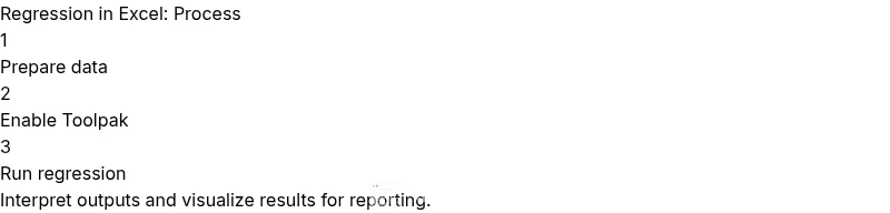
- 1
Prepare your data
Organize your data so the dependent variable is in one column and each predictor in its own column. Clean non-numeric values, handle missing data consistently, and ensure column headers are descriptive for traceability.
Tip: Keep a copy of the raw data before making changes to preserve a baseline. - 2
Enable the Analysis Toolpak
Go to Excel Options, Add-ins, and enable the Analysis Toolpak. This adds the Regression feature used in the next step.
Tip: If you don’t see it, install the add-in via the Office Store or Excel’s Add-ins dialog. - 3
Run regression with the Toolpak
Navigate to Data > Data Analysis > Regression. Select the Dependent Variable (Y) and the Independent Variable(s) (X). Choose an output area and decide whether to include residuals and confidence intervals.
Tip: Label your outputs clearly to avoid confusion when reporting results. - 4
Review the regression output
Examine coefficients, intercept, R-squared, adjusted R-squared, and p-values. Note which predictors are statistically significant and interpret the sign of coefficients.
Tip: Focus on practical significance, not just statistical significance. - 5
Check model assumptions
Plot residuals vs fitted values and assess normality of residuals. Look for patterns that indicate nonlinearity or heteroscedasticity.
Tip: If assumptions fail, consider transformations or alternative models. - 6
Consider LINEST for deeper stats
For a more detailed output, use the LINEST function as an array formula to obtain standard errors, t-statistics, and additional diagnostics.
Tip: Ensure you enter LINEST as an array formula (Ctrl+Shift+Enter) in older Excel versions. - 7
Create visuals to communicate results
Plot observed vs. predicted values and, if applicable, regression lines on scatter plots. Add equations and R-squared annotations to charts.
Tip: Visuals enhance stakeholder understanding and buy-in.
People Also Ask
Can Excel perform multiple regression with more than one predictor?
Yes. Excel can run multiple regression by using the Data Analysis Toolpak with multiple predictor columns. For deeper insight, LINEST can provide additional statistics for the coefficients.
Yes, you can run multiple regression in Excel using the Toolpak or LINEST for more detailed statistics.
How do I interpret the coefficients in the regression output?
Each coefficient represents the expected change in the dependent variable for a one-unit change in the corresponding predictor, assuming other predictors stay constant. The intercept is the expected value when all predictors are zero.
Coefficients tell you how much the dependent variable changes with each predictor, keeping others fixed.
What if R-squared is low?
A low R-squared suggests the model explains little of the variance. Consider adding relevant predictors, transforming variables, or assessing whether a nonlinear relationship exists.
A low R-squared means the model isn’t explaining much variance; consider other predictors or transformations.
Can I use Excel without the Analysis Toolpak?
You can still use LINEST as an array formula to obtain regression statistics without the Toolpak, but the Toolpak provides a guided, simpler workflow.
Yes, you can use LINEST to do regression without the Toolpak, though the Toolpak helps with ease.
How should I handle categorical predictors?
Convert categorical variables to numerical form using one-hot encoding (dummy variables) before regression. Excel does not handle categories directly in standard regression.
Turn categories into dummy variables before running regression.
How can I save or share regression results for reporting?
Copy the regression output to a dedicated sheet, include charts, and document data sources, model assumptions, and limitations for transparent reporting.
Save outputs to a report sheet with visuals and notes about data and assumptions.
Watch Video
The Essentials
- Master regression in Excel with Toolpak for quick results
- Interpret coefficients, R-squared, and p-values to tell a clear story
- Validate assumptions to avoid overconfident conclusions
- Visualize results to boost communication with stakeholders