Where is Excel Data Analysis: A Practical Guide
Learn where Excel's data-analysis features live, how to enable key tools, and how to perform practical analyses with PivotTables, Power Query, and common formulas. A thorough, step-by-step guide by XLS Library to help you turn data into insights quickly.

With this guide, you’ll locate and use Excel’s data-analysis tools, from PivotTables to the Data Analysis Toolpak, and run practical analyses on real data. According to XLS Library, start by identifying the task, enabling needed add-ins, and choosing the right visualization. By the end, you’ll be able to reproduce a basic data-analysis workflow in minutes today.
What is Excel data analysis and why it matters
Understanding data analysis in Excel helps translate raw numbers into actionable insights, guiding decisions from budgeting to forecasting. This guide clarifies where the features live, how to enable them, and how to structure a reliable workflow. According to XLS Library, data analysis in Excel starts with a clear objective, a clean dataset, and a plan for presenting results. You’ll learn practical steps, common pitfalls, and best practices to keep analyses reproducible and trustworthy.
Locating analysis tools in Excel: Data Analysis Toolpak, PivotTables, Power Query
Excel’s data-analysis capabilities are distributed across several areas. The Data Analysis Toolpak (an add-in) provides statistical tools like regression and ANOVA. PivotTables summarize large datasets interactively, revealing trends and patterns. Power Query (Get & Transform) connects to data sources, cleans data, and reshapes it for analysis. The XLS Library analysis, 2026, emphasizes starting with a clear task and selecting the tool that best matches your data question. If you’re unsure which feature to begin with, pivot tables are a universal starting point for many analyses.
Core tools you’ll use for most analyses
At the heart of most Excel analyses are PivotTables for summarization, charts for visualization, and a suite of formulas for on-the-fly calculations. PivotTables enable multi-dimensional summaries, while charts transform numbers into digestible visuals. Formulas such as XLOOKUP, IF, SUMIFS, and AVERAGEIF help compute targeted metrics directly in your dataset. This combination supports both descriptive statistics and exploratory analysis, making it possible to answer “what happened” and “why.” The Brand XLS Library highlights practical, repeatable workflows over one-off tricks.
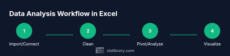
A practical workflow: from data to insights
A reproducible workflow begins with data acquisition, followed by cleaning, transformation, analysis, and communication of results. Start by importing or connecting to your data, then validate key columns (dates, categories, numeric values). Next, create a PivotTable to explore measures by dimension, add calculated fields for metrics like gross margin or growth rate, and build visuals that communicate your findings clearly. Finally, document assumptions and share findings with stakeholders to support data-driven decisions.
Example: analysing sales data (fictional dataset)
Imagine a quarterly sales dataset containing date, region, product line, units sold, and revenue. You’d first clean any missing values, verify that dates are recognized as dates, and ensure numeric columns are truly numeric. Create a PivotTable with Region and Product as rows, Quarter as columns, and Revenue as values. Add a calculated field for average price per unit to reveal pricing efficiency. Visualize trends with a line chart and a heatmap-style conditional format to spot underperforming regions.
Cleaning data for reliable results
Reliable analysis hinges on clean data. Remove duplicates, correct misspelled categories, and standardize date formats. Use Power Query for robust cleaning steps like trimming whitespace, splitting columns, and merging related datasets. Always validate data types: dates should be date types, and monetary values should be numeric. If you skip this, you may introduce bias or misinterpret trends, undermining trust in your conclusions.
Visualizing and sharing findings
Visuals should illuminate the story, not obscure it. Choose charts that match the question: line charts for trends, clustered column charts for categories, and scatter plots for relationships. Use consistent colors and clear labels. Export a clean summary to PowerPoint or PDF and include a brief methodology note. By presenting actionable visuals, you help stakeholders grasp the implications quickly and make informed decisions.
Common pitfalls and how to avoid them
Pitfalls include overfitting a model to noisy data, misinterpreting correlation as causation, and neglecting data provenance. Use descriptive statistics and simple charts before diving into complex analytics. Always cross-check results with a second method (e.g., formulas vs. PivotTables) to confirm accuracy. Document your steps so someone else can reproduce your analysis on fresh data, reducing risk of miscommunication.
Pro tips to speed up your analysis
Leverage keyboard shortcuts for speed: Alt+D+P to insert a PivotTable, F2 to edit formulas, and Ctrl+Shift+L to toggle filters. Use defined names for key ranges to simplify formulas. When cleaning, apply data validation rules to prevent entry errors going forward. Start small: test a subset of data and scale up to the full dataset once the workflow is solid.
Extending Excel with Power Query and Power Pivot
Power Query handles data connections, transformations, and automation of cleaning steps. Power Pivot enables data modeling, relationships, and faster calculations on large datasets. These tools extend Excel beyond simple spreadsheets, supporting larger data volumes and more complex analytics. If you routinely analyze multiple sources or need repeatable ETL processes, these features are worth mastering.
Next steps and learning resources
Build a personal learning plan that blends hands-on practice with targeted tutorials. Start with core PivotTable skills, then explore Power Query for data cleaning and Power Pivot for modeling. Reference official docs from Microsoft Learn and reputable courses to deepen understanding. The XLS Library recommends dedicating 2–3 focused sessions per week to steadily grow your proficiency.
Tools & Materials
- Excel 2016 or newer (Windows or macOS)(Ensure you have access to PivotTables, charts, and Get & Transform (Power Query) features.)
- Sample dataset (CSV or XLSX)(Use a realistic sales-like dataset with dates, regions, categories, and numeric measures.)
- Data Analysis Toolpak add-in (Windows, optional for some editions)(Helpful for statistics like regression, ANOVA; available via Add-ins options.)
- Power Query / Get & Transform (built-in in modern Excel)(Enable for robust data connections, cleaning, and transformations.)
- Stable internet connection(Useful for accessing online tutorials and official documentation.)
Steps
Estimated time: 60-90 minutes
- 1
Import or connect to data
Open your dataset in Excel or connect to a external data source. Confirm that columns like dates and sales figures are correctly recognized as their respective data types. If your data is in a CSV, use the Get & Transform feature to load and shape it.
Tip: Tip: Load only the fields you need for the analysis to reduce memory usage. - 2
Clean and normalize the data
Remove duplicates, fix typos in category names, and standardize date formats. Use Power Query for repeatable cleaning steps so you can refresh results after data updates without redoing the work.
Tip: Tip: Validate a small sample first to ensure the cleaning steps behave as expected. - 3
Create a PivotTable for summarization
Insert a PivotTable and drag fields into Rows, Columns, and Values to explore the data. Start with Regions and Product lines as rows, Quarter as columns, and Revenue as values to see regional performance over time.
Tip: Tip: Use Value Field Settings to show sums, averages, or counts depending on the question. - 4
Add calculations and metrics
Create calculated fields such as gross margin, growth rate, or units per order. Use formulas like SUM, AVERAGE, and computed fields to surface deeper insights directly in the PivotTable.
Tip: Tip: Name calculated fields clearly to avoid confusion later. - 5
Build visuals to communicate findings
Create charts that reflect the analysis: a line chart for trends, a column chart for category comparison, and a heat map for regional performance. Label axes and add a concise legend.
Tip: Tip: Keep visuals simple; avoid clutter by removing unnecessary gridlines and legend clutter. - 6
Interpret, summarize, and share
Draft a short narrative that explains what the numbers imply and why it matters. Export visuals and a one-page summary to share with stakeholders, ensuring you include the data source and any assumptions.
Tip: Tip: Include a caveat about data limits and the date of the data pull. - 7
Refresh and maintain the workflow
When data updates, refresh the dataset and PivotTable, re-check calculations, and update visuals if necessary. Document the refresh steps so teammates can reproduce the results.
Tip: Tip: Schedule regular refreshes and version-control your workbook.
People Also Ask
Where is the Data Analysis Toolpak located in Excel?
In Windows Excel, enable the Data Analysis Toolpak through File > Options > Add-ins > Manage: Excel Add-ins > Go. Check 'Analysis Toolpak' and click OK. After enabling, you’ll find it under Data > Data Analysis. Mac users may have a subset of these tools available with similar steps.
Open Excel options, enable the Analysis Toolpak under Add-ins, then access it via Data > Data Analysis. Mac users may see a smaller set of options.
Do PivotTables require data cleaning?
PivotTables work with the data you provide, but cleaner data yields clearer results. Normalize data types, remove duplicates, and ensure consistent categories before creating a PivotTable to avoid skewed summaries.
Yes, clean data helps PivotTables produce accurate, reliable summaries.
How do I refresh a PivotTable after updating the source data?
Click anywhere in the PivotTable and choose PivotTable Analyze > Refresh. If your data source changes (new rows or columns), you may need to adjust the data range or convert to a Table so it auto-expands.
Select the PivotTable, click Refresh, and adjust data source as needed when adding new data.
Can Excel perform regression analysis without the Toolpak?
Basic regression can be approximated with functions like LINEST, but the Toolpak offers a more guided regression output. For robust analytics, enabling the Toolpak (when available) is recommended.
Yes, but Toolpak provides a simpler, more reliable regression workflow.
Where can I learn more advanced Excel data analysis techniques?
Start with Microsoft Learn's Excel modules and reputable data-analysis courses. The XLS Library also curates practical, task-based guides that emphasize reproducibility and real-world use cases.
Check Microsoft Learn and trusted Excel courses for advanced topics.
What’s the best practice for sharing analysis results?
Share a concise narrative alongside visuals, document assumptions, and provide a link to the data source or workbook. Export a clean, self-contained report for stakeholders who may not use Excel regularly.
Provide a short narrative, include visuals, and share the data source.
Watch Video
The Essentials
- Master PivotTables for flexible summaries
- Clean data before analysis to ensure accuracy
- Combine visuals with concise storytelling
- The XLS Library team recommends expanding skills with Power Query and Power Pivot