How to Get Excel Data Analysis: A Practical Guide
Learn practical steps to pull, clean, analyze, and visualize data in Excel using Power Query, PivotTables, formulas, and charts. This XLS Library guide shows how to get excel data analysis with repeatable workflows and actionable insights.

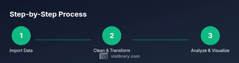
Goal: you will learn to pull, clean, analyze, and visualize Excel data using built-in tools such as Power Query, PivotTables, formulas, and charts. You’ll work with a sample dataset, ensure data quality, and produce insights and shareable reports. Requirements: Excel 2019 or Microsoft 365, a clean data source (CSV/Excel), and a clear objective. Steps: import data, shape and clean, analyze, and visualize.
Why Excel data analysis matters
In today’s workplaces, how to get excel data analysis is a practical skill that translates raw numbers into decisions. Excel remains the entry point for many analysts because of its ubiquity, compatibility with data sources, and powerful built-in tools. When you can pull data into a single workbook, you can explore patterns, test hypotheses, and share reproducible insights with teammates. According to XLS Library, starting with a clear objective and a clean dataset dramatically improves your results. This guide focuses on practical workflows you can apply today, regardless of your industry. By the end, you’ll be able to turn raw numbers into actionable intelligence using familiar Excel features like Power Query, PivotTables, formulas, and charts.
The journey begins with a well-defined objective and ends with a repeatable process that you can re-use on future datasets. You’ll learn how to connect data sources, clean inconsistencies, compute meaningful metrics, and present findings in an accessible way. The goal isn’t just to crunch numbers—it’s to tell a story with your data that stakeholders can act on.
Data sources and data quality
Data sources vary from internal systems and exported files to public datasets. The first step is to confirm the data format, frequency, and completeness. Maintain a data dictionary: list every field, its type, allowed values, and business meaning. This helps avoid misinterpretation and ensures consistency across analyses. Data quality matters most when decisions hinge on metrics. If you start with messy data, your results will be unreliable no matter how clever your formulas are. The XLS Library analysis shows that teams who invest time in upfront cleansing save hours later in the project. In practice, you’ll prefer CSVs or Excel files with consistent headers, well-defined date formats, and standardized units. When sources change, note the version and refresh path to keep your analysis repeatable.
Remember to validate data provenance and consider privacy implications when handling sensitive information. Document any assumptions or exclusions so others can reproduce your work.
Cleaning and shaping data with Power Query
Power Query transforms raw data into a tidy table without changing the original source. Start by importing the data, then use the editor to remove unwanted columns, trim whitespace, set correct data types, and split or merge columns as needed. Always promote headers and ensure there are no blank rows in the dataset. Create reusable steps so changes can be reapplied when the data updates. Load the final result into a worksheet or directly into the Data Model for large datasets. The goal is to have a clean, stable table that supports repeatable analyses and accurate aggregations.
Power Query makes it easier to handle recurring cleansing tasks, such as standardizing date formats or normalizing text case, which reduces downstream errors and speeds up refreshes.
Defining metrics and calculations with formulas
Identify the key metrics you need: totals, averages, counts, growth rates, and ratios. Use Excel functions such as SUMIFS, AVERAGEIFS, COUNTIFS, DATE functions for year/month extraction, and logical functions like IF to classify data. Create derived fields when helpful, such as a month-year column for time-series analyses. Name ranges or create small tables to simplify formulas. Document the logic behind each metric so it’s clear to others reviewing your workbook. Build a small calculation sheet to keep all essential formulas in one place for easy auditing.
Smart metrics reveal the story behind your data and help avoid misinterpretation.
Building PivotTables for analysis
PivotTables summarize large datasets quickly and flexibly. Create a PivotTable from the cleaned data (or Data Model if you’ve loaded to that). Drag dimensions (e.g., product, region) to Rows, and your metrics to Values. Use Slicers and Timeline controls to filter interactively. Experiment with different layouts to reveal patterns that aren’t visible in raw data. When data changes, refresh the PivotTable and verify the results. A well-structured PivotTable can replace many static reports and provide interactive insight for stakeholders.
To maintain speed, keep a named PivotTable as a standard layout that you can reuse across projects.
Visualizing findings with charts and dashboards
Charts tell a story. Choose chart types that match the data and the insight you want to emphasize: column charts for totals, line charts for trends, bar charts for comparisons, or combo charts for mixed metrics. Place charts on a dashboard with clear titles, axis labels, and consistent color schemes. Use data labels sparingly to avoid clutter. Add slicers or filters to allow stakeholders to explore scenarios. Take a moment to ensure your visuals scale well when printed or exported as PDF. A clean dashboard communicates results at a glance and supports faster decision-making.
Follow a visual hierarchy: the most important insight should be the focal point, with supporting visuals guiding the reader.
Creating repeatable workflows and templates
To scale your Excel data analysis, create templates: a master workbook with defined data connections, Power Query steps, and PivotTable layouts. Document the steps in a runbook and save versioned files. Use named ranges and data models to keep references stable. When you train teammates, provide a quick starter guide and a sample dataset. This approach reduces time-to-insight and minimizes mistakes. Consider modular templates: separate the data layer from the presentation layer to simplify updates and reuse across projects.
A disciplined template approach accelerates onboarding and promotes consistency across analyses.
Authority sources
This section provides reputable references for deeper learning and validation of methods. You can consult the following:
- https://support.microsoft.com/en-us/excel
- https://docs.microsoft.com/en-us/power-query/
- https://www.nist.gov/topics/data-analysis
Tools & Materials
- Excel software (Excel 2019 or Microsoft 365)(Essential for Power Query, PivotTables, and built-in formulas)
- Sample dataset (CSV or Excel file)(Use a clean, well-structured dataset with headers)
- Reliable data source(Pre-validated data source to avoid downstream errors)
- Computer with internet access(Stable environment to run Power Query and save work)
- Backup storage(Keep backups of datasets and workbooks)
Steps
Estimated time: 60-90 minutes
- 1
Import data into Excel
Open a new workbook, choose Data > Get Data, and select your source (CSV, Excel, or database). Import into a structured table to enable clean references. Aim to bring in a clean, representative slice of the dataset.
Tip: Name the query and table clearly for future reference - 2
Shape data with Power Query
Use Power Query Editor to filter rows, promote headers, and remove extraneous columns. Apply changes to load as a table or into the Data Model for advanced analysis.
Tip: Keep a readable sequence of steps so you can re-run after updates - 3
Clean data: correct types and duplicates
Check data types (date, number, text) and remove duplicates to ensure accurate analysis. Validate ranges and ranges for consistency. Revisit header names for clarity.
Tip: Preview results before loading; fix anomalies early - 4
Define core calculations
Create essential metrics using formulas (SUMIFS, AVERAGEIFS, COUNTIFS) and derived fields like month-year. Name ranges to simplify formulas and improve readability.
Tip: Document the logic behind each metric in a separate sheet - 5
Build a PivotTable
Insert PivotTable, choose the data model if using Power Query output, and add rows/columns to summarize data. Apply filters and slicers to focus the view.
Tip: PivotTables auto-update when the source changes - 6
Create charts and dashboards
Add visuals like column, line, or bar charts. Combine visuals into a dashboard with slicers and a clear narrative. Ensure labels are legible.
Tip: Keep visuals simple and readable; avoid clutter - 7
Document and save workflow
Record steps as a runbook, save with versioning, and include data sources and assumptions. Share the workbook with a short user guide for teammates.
Tip: Include a changelog for future updates
People Also Ask
What is data analysis in Excel?
Data analysis in Excel means organizing, cleaning, and summarizing raw data to identify patterns, trends, and insights. It relies on tools like formulas, PivotTables, and charts to turn data into actionable information.
Data analysis in Excel means turning raw data into clear insights using formulas and visualizations.
Which Excel tools are essential for data analysis?
The core tools are Power Query for cleaning, PivotTables for summarizing, formulas for calculations, and charts for visualization. Data models can handle larger datasets when needed.
Power Query, PivotTables, formulas, and charts are the essentials.
Do I need Power Query to analyze data in Excel?
Power Query is highly recommended for reliable data cleaning and shaping, but you can perform many tasks with standard Excel features. Power Query automates repetitive steps and improves reproducibility.
Power Query is very helpful, though not strictly required for all tasks.
How long does it take to learn Excel data analysis?
Time varies with your starting point. A solid basic workflow can be learned in a few hours, while mastering advanced analytics may take weeks of practice.
Learning time depends on your starting point; start with a small project.
Can Excel handle large datasets for analysis?
Excel can handle sizable datasets, especially with Power Query and data models; performance depends on hardware and file size. For very large data, consider Power BI or databases.
Yes, but it depends on data size and hardware.
What is the difference between a table and a range in Excel analysis?
Tables provide structured references, automatic filtering, and easier PivotTable integration; ranges are flat data blocks without these features.
Tables are more powerful for data analysis.
Watch Video
The Essentials
- Plan your objective before pulling data
- Power Query and PivotTables are essential
- Keep workflows reproducible with documentation
- Validate data quality before analysis