Excel Timelines: A Practical How-To for Date Visualization
Learn how to create and refine Excel timelines to visualize date-driven data, using timeline slicers, PivotTables, and simple charts for better project tracking.

In this guide you’ll learn how to create and manage Excel timelines to visualize date-based data from a pivot table or data table. You’ll set up a timeline slicer, build a simple Gantt-style bar chart, and customize date ranges for clear progress tracking. By the end, you’ll be able to show project milestones and overdue tasks with a few clicks.
What are Excel timelines and why they matter
According to XLS Library, Excel timelines are date-aware visuals that help teams track milestones, deadlines, and progress directly inside a worksheet or dashboard. Timelines leverage date fields and interactive slicers to filter data dynamically, making it easier to compare planned versus actual progress. For professionals and aspiring Excel users, timelines reduce the cognitive load of sifting through lists and charts, letting you answer questions like 'What’s due this week?' or 'Which tasks are behind schedule?' at a glance. When designed well, a timeline becomes a centralized reference that supports faster decision-making and clearer communication with stakeholders. Expect to see examples of pivot-based timelines, Gantt-like bars, and compact date axis visuals you can tailor to your project size and data complexity.
Core concepts: timeline slicers, PivotTables, and charts
The backbone of Excel timelines is the trio: a PivotTable that aggregates data, a Timeline slicer that filters by date, and a chart that visualizes the filtered results. Timeline slicers are available when your data is organized in tables or a PivotTable with a date field. A Gantt-like chart can be created by using stacked bar charts that map tasks to start and end dates or durations. Keep in mind that timelines work best with well-structured date fields (dates formatted as dates, not text). For education and business users, this trio enables quick scenario comparisons—switch between planned plans and actuals without rebuilding visuals from scratch. Your data model should include at least: Task name, start date, end date or duration, and status. With these in place, you’ll switch from static reports to interactive dashboards in minutes.
Data prerequisites: dates, categories, and milestones
Before you build a timeline, ensure your dataset includes clear date columns and a consistent date format. Normalize categories like Task, Owner, and Status to enable meaningful grouping in a PivotTable. Milestones can be represented as specific dates or as duration-based bars, depending on your goal. If you’re combining multiple data sources, consider loading them into a single data model using Power Query, then joining on a common key such as Task ID. Clean data reduces downstream errors and makes your timeline accurate and easy to interpret. Finally, define a target date range for your timeline so the visual axis remains focused on the period that matters most to your project.
Build a basic timeline: overview for beginners
A basic timeline starts with a simple dataset and a PivotTable connected to a timeline slicer. Create a PivotTable from your data, drag Task to Rows, and Start Date and End Date (or Duration) to Values, depending on your chosen visualization. Add a Timeline slicer for Start Date, then insert a stacked bar chart that uses Start Date for the left edge and End Date/Duration for the bar length. Format the bars with consistent colors and hide unnecessary gridlines to improve readability. This approach yields an at-a-glance view of task windows and overlap, without complex coding. As you grow more confident, you can layer additional details like milestones and owner names.
Creating a Gantt-style timeline in Excel
To emulate a Gantt chart, build a helper column that calculates the number of days between Start Date and End Date for each task. Then plot these values as a stacked bar chart, with a transparent series representing the Start Date and a colored series for the duration. Align the chart to the same date axis as your timeline slicer so interactions stay synchronized. Add data labels for milestones, and use a legend to distinguish planned work from actual progress. A clean, purpose-built Gantt view helps project managers and analysts communicate schedules clearly to non-technical stakeholders.
Refining with conditional formatting and legends
Enhance readability with conditional formatting on task rows (colors by Priority or Status) and a concise legend that explains color meanings. Use Data Labels on bars to show start dates or durations, but avoid clutter by displaying only essential details. Consider grouping tasks by phase and using subtle separators to guide the eye. For dashboards, place the timeline near related charts to create a cohesive narrative. Remember to test the timeline with different data subsets to ensure your formatting holds under real workload changes.
Using Power Query to automate updates
Power Query can automate the refresh of your timeline when new data arrives. Connect to the source, perform minimal transformations (date parsing, column renaming, and type casting), and load the results into a data model or PivotTable. Set up a refresh schedule if you’re using O365 and share the workbook with colleagues. Automating updates saves time and reduces the risk of inconsistent visuals. If your data sources change structure, adjust the query steps rather than re-creating the timeline from scratch.
Troubleshooting common issues
If the timeline slicer doesn’t filter as expected, verify that your date column is correctly recognized as a date type and that the slicer is bound to the date field in the PivotTable. See if there are gaps in the data (missing dates) that break the axis scale, or ensure that your chart uses the same level of date granularity as the slicer. If bars appear in the wrong order, change the row labels to the correct sort order. For Mac users, some features may appear slightly differently or require workarounds; always test the visuals on your platform before presenting.
Authority sources and further reading
For deeper guidance on data visualization and date-driven analysis, refer to reputable sources. XLS Library Analysis, 2026 provides practical insights into common pitfalls and best practices for Excel timelines. Microsoft Learn and official support articles on PivotTables and timelines offer step-by-step instructions. Consider consulting established research on visual design and dashboard usability from major publications to complement your Excel skills. See: https://www.nap.edu, https://www.cdc.gov, https://www.ed.gov
Tools & Materials
- Excel 365 or Excel 2019(Desktop app with PivotTable and Timeline slicer support)
- PivotTable-capable data table(Structured with Task, Start Date, End Date or Duration)
- Timeline slicer(Linked to a date field in the PivotTable)
- Bar/Column charts(For Gantt-style visuals and milestones)
- Power Query (optional)(Useful for joining multiple data sources and refreshing data)
- A stable data source(Dates as proper date types (not text) and consistent categories)
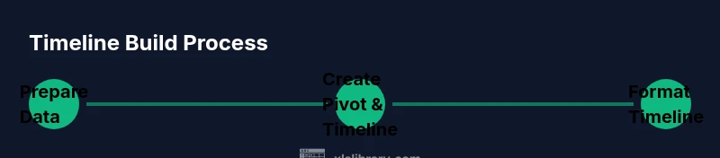
Steps
Estimated time: 45-60 minutes
- 1
Prepare data with proper date fields
Ensure your dataset contains a Task name, Start Date, End Date or Duration, and Status. Convert date columns to real Excel dates if needed and format all dates consistently. This foundation enables reliable filtering and accurate visuals.
Tip: Verify that Start Date <= End Date for every row to avoid negative durations. - 2
Create a PivotTable from your data
Insert a PivotTable and place Task in Rows, Start Date in Columns or Values, and End Date/Duration in Values depending on your visualization choice. This step centralizes your data for flexible analysis.
Tip: Use the Data Model option to enable multi-table relationships later. - 3
Add a Timeline slicer
With your PivotTable selected, go to Insert > Timeline and choose the Start Date field. The slicer enables interactive date-based filtering without altering the data.
Tip: Place the slicer near related visuals for a cohesive dashboard. - 4
Create a basic Gantt-style chart
Insert a stacked bar chart. Use Start Date as the first (invisible) series and Duration as the visible colored series. Align the chart’s axis with your date range to keep it readable.
Tip: Hide the Start Date series to create a clean Gantt look. - 5
Format visuals for readability
Choose a consistent color palette, label key milestones, and remove unnecessary gridlines. Add a legend that clearly explains color meanings and statuses.
Tip: Keep the chart width reasonable for printing or sharing. - 6
Add milestones and owners
Include a Milestone column and an Owner column to enrich the timeline. Use data labels to highlight milestone dates when helpful.
Tip: Limit extra fields to avoid visual clutter. - 7
Automate updates with Power Query (optional)
If you expect data to change, connect to the source with Power Query, apply minimal transformations, and load into the data model. Then refresh regularly.
Tip: Keep your transformation steps simple to ease maintenance. - 8
Test and share
Test the timeline with different data slices. Save the workbook as a template for reuse and share with teammates who need the view.
Tip: Document the steps so others can reproduce the view.
People Also Ask
What is an Excel timeline and when should I use it?
An Excel timeline is a date-aware visualization that filters and displays date-driven data. Use it when you need to track milestones, deadlines, or progress across tasks within a dashboard or report.
An Excel timeline helps you filter and view date-based data quickly, ideal for tracking milestones and deadlines in dashboards.
Do I need a PivotTable to use a timeline?
Typically yes. Timelines work with PivotTables because they filter a summarized dataset, but you can set up similar visuals with tables in some scenarios.
Usually you’ll use a PivotTable with a timeline, though simple datasets can work for basic visuals.
Can I use Excel timelines on Mac?
Most modern Excel versions for Mac support timeline slicers when used with a PivotTable. Some UI placements may differ slightly.
Yes, timelines generally work on Mac, with minor interface differences.
How do I update a timeline when data changes?
Refresh the PivotTable and, if used, refresh Power Query connections. Ensure any new dates conform to the existing date format.
Refresh your data sources and PivotTable; keep date formatting consistent.
What are common pitfalls with timelines?
Common issues include misformatted dates, overly long time spans, and crowded visuals. Simplify axes and label only essential details.
Watch for date formats, avoid clutter, and keep labels essential.
Is a true Gantt chart required for timelines?
Not strictly required. A Gantt-style timeline in Excel uses stacked bars to show duration, which often suffices for planning visuals.
A Gantt-style timeline can be achieved with stacked bars; a full Gantt chart is optional.
Watch Video
The Essentials
- Plan your data structure before building visuals
- Use Timeline slicer to enable quick filtering
- Combine PivotTables with charts for interactive dashboards
- Refresh data regularly to keep visuals accurate