Excel Gantt Chart: A Practical How-To Guide
Learn to build a practical Excel Gantt chart to plan projects, track milestones, and manage tasks directly in Excel. Step-by-step guidance, tips, and a ready-to-adapt template.

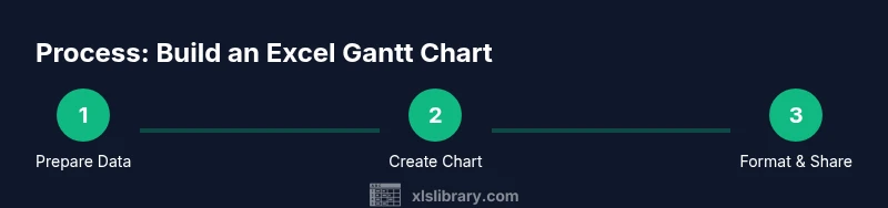
In this guide, you will learn to build an Excel Gantt chart from a simple task list, using a stacked bar chart and basic formatting. You’ll prepare your data, create the chart, apply date calculations, and refine visuals for clear planning and tracking. No advanced software is required, and you can adapt the method for teams of any size.
What is an Excel Gantt Chart?
In its essence, an Excel Gantt chart is a timeline visualization that maps tasks to dates. While Excel isn't a dedicated project management tool, you can use its built-in charting features to visualize task durations, overlaps, and critical paths. According to XLS Library, this approach leverages the familiar stacked-bar chart to display each task as a horizontal bar spanning its start date and duration. This format makes dependencies and scheduling decisions easier to communicate without leaving the spreadsheet environment. It’s particularly useful for small teams, ad-hoc projects, or when you want to keep everything in one workbook. You’ll often combine a base date axis with helper columns to control the visible bars and to reflect progress. The result is a lightweight, adaptable timeline that can be customized to your team’s needs. The technique emphasizes clarity over complexity, letting you iterate quickly as plans evolve.
Why use Excel Gantt charts?
A Gantt-style timeline in Excel keeps planning visible in a familiar workspace, reducing the need to switch between tools. It enables quick what-if scenarios, such as shifting start dates to test resource load or rescheduling milestones after a late task. Because Excel is widely adopted in many teams, sharing a single workbook is straightforward, and you can embed your Gantt view alongside task lists, budgets, and risk registers. From the perspective of XLS Library, this approach lowers barriers to entry for beginners while still providing meaningful visuals for experienced users. You gain flexibility: you can tailor the level of detail, color-code by workstream, and attach notes or dependencies directly to rows. The result is a living planning document that stays in your usual workflow rather than living in a separate PM tool.
Data prerequisites and structure
To build a functional Excel Gantt chart, you need a structured data table. At minimum, include: Task name, Start date, Duration (in days), and Status or % complete. Optional but helpful columns include End date, Dependencies (which task must precede this one), Milestones (special dates to highlight), and Assigned to. Consistency matters: use a consistent date format (ISO 8601 is a solid choice), and ensure all date calculations reference a single project start date. With clean data, Excel can render accurate bars that reflect real-world sequencing. This organization also makes it easier to refresh the chart when plans change, and it supports adding baselines or progress indicators later in the workflow.
Data layout best practices for Gantt charts
Choose a layout that minimizes formula complexity and maximizes readability. A common approach is to list tasks in rows, with separate columns for Task, Start, Duration, and Dependencies. Place a Project Start date once and reference it in all date calculations. If you expect a long list of tasks, consider turning the data into an Excel Table (Ctrl-T) so your formulas and the chart expand automatically when you add new rows. Use a small, consistent font, and align dates to a weekly or daily grid that suits your project horizon. Finally, keep a separate sheet for milestones and a second sheet for baseline comparisons to avoid clutter in the main chart.
Building a basic Gantt chart in Excel
The core idea is a stacked bar chart where the first series is a hidden offset (Start) and the second series is the duration. When the Start series is formatted with no fill, only the Duration portion remains visible, creating the familiar Gantt bars that start at each task’s start date. This structure makes it easy to update the chart as dates shift, while preserving clear task labeling on the left. Excel’s horizontal axis should represent dates, so you’ll adjust the axis scale to display your project timeline in weeks or days, depending on the project length.
Extending the chart with dependencies and milestones
Dependencies can be represented by ordering tasks with a logical sequence and, where possible, by color-coding or annotations. Milestones can be added as a separate data series, using a different symbol or color to stand out from regular task bars. You can also add a baseline series to compare planned dates against actual progress, which is especially helpful for status meetings. Keeping dependencies explicit in your data table helps ensure the chart updates consistently when a predecessor shifts.
Formatting and readability tips
Use a consistent color palette to differentiate workstreams, assign a legend, and ensure contrast for readability. Turn on gridlines to help readers align bars with dates, but avoid over-clutter by limiting major gridlines. Label only the necessary axes and, if the chart becomes crowded, switch to a 2-row task header or use tooltips to convey extra detail. Finally, protect cells that drive the chart so that accidental edits don’t derail your timeline.
Sharing, updating, and maintaining your chart
Treat your Gantt chart as a living document. Use Excel Tables or defined names so formulas and ranges adjust automatically when you add tasks. Save a reusable template and document the data structure in a README tab. Schedule regular reviews to update progress (% complete) and adjust dependencies as needed. When sharing, consider exporting a PDF or publishing a read-only version to prevent accidental edits to the data behind the visuals.
Real-world example and quick-start checklist
A small marketing project serves as a practical example: tasks include Brief, Creative Concept, Copy Draft, Design, Review, and Launch. Start date is Day 1; durations range from 2–5 days. The checklist: (1) prepare Task/Start/Duration columns, (2) insert a stacked bar chart, (3) hide the Start offset, (4) format bars by workstream color, (5) add milestones for major approvals, (6) verify the axis displays the project horizon correctly, (7) share the workbook with the team.
Tools & Materials
- Microsoft Excel (Windows or macOS)(Excel 2016 or later recommended for best chart features)
- Project task list in a single workbook(Columns: Task, Start Date, Duration, Dependencies, Milestones)
- Consistent date formats(Use ISO or a fixed regional format; ensure all date formulas reference a single project start date)
- Color palette for visuals(Choose 4–6 colors to represent different workstreams)
- Template workbook(Optional, for reuse on new projects)
Steps
Estimated time: 60-90 minutes
- 1
Prepare your data set
Create a dedicated table with Task, Start Date, Duration (days), and Dependencies. Add optional Milestones and % Complete columns. Ensure all dates reference a single Project Start date. This consistency makes calculations reliable and the chart responsive.
Tip: Use an Excel Table (Ctrl-T) so new tasks auto-append with proper formulas. - 2
Create a helper offset column
Add a Start Offset column that computes days from the Project Start to each task's Start Date (e.g., =StartDate - $A$2). This value drives where each bar begins on the chart.
Tip: Keep the offset column hidden in the final view to keep the chart clean. - 3
Insert a stacked bar chart
Select Task, Start Offset, and Duration, then insert a Stacked Bar Chart. The Start Offset acts as a spacer, while Duration fills the visible bar.
Tip: Place the chart directly beside the data table for easy reference. - 4
Hide the Start Offset series
Format the Start Offset series to have no fill. This reveals the actual duration bars that align with start dates.
Tip: Double-check that the bars align with the correct dates on the axis. - 5
Format axes and add labels
Set the horizontal axis to display dates (weekly or daily granularity) and label each task on the vertical axis. Ensure the project start date is visible and the scale matches the timeline length.
Tip: Turn on data labels for durations if helpful for quick glanceability. - 6
Add milestones and dependencies
Create a Milestones column and plot it as a separate data series with a distinct symbol or color. Indicate dependencies by ordering tasks or using connector annotations.
Tip: Keep milestones visually separate from regular task bars to avoid confusion. - 7
Make it dynamic and shareable
Convert ranges to a named range or structured table so adding tasks updates the chart automatically. Save as a template and provide a brief data dictionary for teammates.
Tip: Share as both an editable workbook and a read-only PDF for stakeholders.
People Also Ask
What is an Excel Gantt chart?
An Excel Gantt chart is a timeline visualization created with a stacked bar chart that maps tasks to dates. It helps you see start dates, durations, and overlaps within a familiar spreadsheet environment.
An Excel Gantt chart is a timeline made with a stacked bar chart in Excel, showing when tasks start and how long they take.
Can Excel handle dependencies between tasks in a Gantt chart?
Yes, by structuring your data with a Dependencies column and ordering tasks accordingly, you can reflect sequencing in the chart. Complex dependencies may require manual adjustments or lightweight formulas.
Yes, you can reflect sequencing with a dependencies column and careful task ordering. For complex cases, you might adjust manually.
Do I need any add-ins to create a Gantt chart in Excel?
No add-ins are required for a basic Gantt chart. You can achieve a fully functional timeline with standard Excel charts and simple data layout.
No add-ins are needed for a basic Gantt chart; built-in charts and simple data are enough.
Is Excel suitable for large, complex projects?
Excel can handle moderately complex projects, but very large or highly interdependent schedules may be better served by dedicated PM software. Use filters and multiple sheets to manage complexity.
For very large projects, dedicated PM tools might be better, but you can manage complexity in Excel with filters and multiple sheets.
Can I print a Gantt chart from Excel?
Yes. Set the print area to the chart and adjust page orientation and scaling to fit the timeline. Consider a landscape layout for wider charts.
Yes, you can print it by setting the print area and using landscape orientation to fit the chart.
How often should I update the chart?
Update the chart whenever task dates or durations change. Periodic reviews help maintain accuracy and keep stakeholders aligned.
Update it whenever dates or durations change, and review it regularly to stay aligned.
Watch Video
The Essentials
- Plan data in a single, clean table for reliability
- Use a hidden Start Offset to position bars accurately
- Format for readability: color, labels, and axis scale
- Add milestones and baselines to improve visibility