Excel to Timeline: Turn Spreadsheets into Visual Timelines
Learn how to convert Excel data into a clear, visual timeline with practical steps, formulas, and real world examples. Turn spreadsheets into timelines you can share.

Excel to timeline lets you transform date based data in a spreadsheet into a visual schedule. You can build a basic Gantt like timeline, highlight milestones, and track progress using built in charts, formulas, and conditional formatting. This guide provides practical, step by step methods to create and maintain timelines straight from Excel data.
What excel to timeline means in practice
Excel to timeline is the process of converting date based data in a spreadsheet into a visual schedule that shows tasks along a horizontal time axis. The goal is to make milestones, durations and dependencies easy to read at a glance. According to XLS Library, turning raw task lists into a timeline helps teams focus on deliverables and deadlines. Start with a clean data table that includes a date column, a task name and an optional status. From there you can choose a chart style such as a simple Gantt like bar or a stacked bar timeline. The key is to maintain consistent date formats and to separate data for display from underlying calculations. This article teaches practical steps to go from excel data to a usable timeline that supports planning, tracking and communication.
Why timelines from Excel are powerful
Timelines created in Excel keep data in one place while presenting it visually. Benefits include quick scenario planning, easy sharing in meetings and the ability to reuse the same data for dashboards, calendars or reports. With familiar Excel tools you can sort or filter by owner, priority or status, adjust durations with simple math, and refresh the view as work progresses. Because many teams already store task lists in Excel, timelines avoid tool hopping and reduce setup time. The result is a living artifact that aligns stakeholders around milestones and critical dates. As the XLS Library team notes, the approach balances accessibility with power for both beginners and experienced users.
Data sources you can timeline in Excel
Count on a wide range of data sources to feed a timeline. Project plans stored in Excel, product roadmaps from product managers, event calendars, and research milestones all map well to a timeline when you have a date or date range per row. You can include columns for Task ID, Task Name, Start Date, End Date, Duration and Status. If you have predecessor relationships or dependencies, you can encode them with a separate Dependency column. For external data, a simple copy paste or a Power Query connection can bring data into the same table. The result is a single source of truth that supports planning during kickoff and updates during execution. Keep the data lean and consistent to avoid misinterpretation.
Building a basic timeline in Excel
To build a basic timeline start with a simple table and a chart. Create a Start Date column and a Task column. Add a Duration column that computes days between start and end. Insert a stacked bar chart where the first series is the Start Date but formatted to be invisible, leaving the Duration bar visible. This creates a Gantt like timeline. Label every bar with the task name for clarity. Customize the horizontal axis to show date units that fit your project. The more you align the chart with a clean data structure, the easier it is to maintain.
Enhancing timelines with milestones and dependencies
Milestones can be highlighted with distinct colors or markers placed at key dates. Add a Milestone column and use conditional formatting to set a bright color for milestone rows. For dependencies, use a separate sheet to define which tasks must start after others finish, then use Excel formulas to enforce or visualize these relationships. You can also add a Status column that uses color coding to reflect progress. When you adjust a Start Date, the chart should automatically shift, ensuring the timeline remains accurate. This section teaches practical ways to turn a static list into a living plan.
Visual best practices for timelines
Clarity comes first. Use a single, readable font and limit the color palette to 4 to 6 hues. Align your tasks left and time axis bottom to maximize scannability. Include a legend only if there are multiple data series. Use gridlines sparingly and prefer a white background for print friendly output. Add axis labels such as Start, End and Duration so readers understand the data at a glance. Finally test the timeline by sharing a copy with a colleague and gather feedback before finalizing.
Automating timeline updates with formulas
Automating updates reduces manual work and errors. Use structured references in Excel tables to keep formulas robust. A popular approach is to compute Duration as End Date minus Start Date and to use XLOOKUP or VLOOKUP to pull Status or Owner from related tables. You can create a dynamic named range to ensure new tasks are included in the chart. If you want real time dashboards, consider linking to a separate data source or refreshing Power Query queries. The result is an up to date timeline with minimal effort.
Common pitfalls and how to avoid them
Common issues include inconsistent date formats, missing end dates and data drift when new tasks are added without updating dependent logic. Avoid these by enforcing a date format on import, requiring End Date in the data entry form, and validating the data with simple checks. Another pitfall is over loading the timeline with too many tasks where the chart becomes unreadable. Break large projects into phases and group tasks into logical lanes. Finally keep a backup copy before large revisions.
Authority sources
When learning how to translate data into a timeline in Excel, trust established guidelines from leading sources. For practical instructions see Microsoft Learn resources on Excel charting and timelines, and review project management best practices from PMI's learning library. For high level insights, reputable business publications like Harvard Business Review also discuss the importance of clear visual timelines in planning and execution.
Tools & Materials
- Laptop or desktop with Excel 2016+(Any platform (Windows or macOS) with charting capabilities)
- Date column in YYYY-MM-DD format(Ensure consistent formatting to enable sorting and calculations)
- Task/Name column(Clear, concise milestone or task names)
- Duration or End Date column(Used to generate the visible timeline bars)
- Optional: Power Query or Data Model(Helpful for large data sets or live connections)
Steps
Estimated time: 60-90 minutes
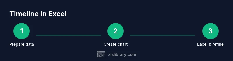
- 1
Prepare your data
Create a simple table with Task Name, Start Date, End Date or Duration, and Status. Ensure all dates use a consistent format. This step sets the foundation for a reliable timeline.
Tip: Use Excel Tables to automatically extend ranges as you add new tasks. - 2
Set up a timeline table
Add derived columns such as Duration = End Date - Start Date or a separate Start Offset for chart alignment. Keep a separate column for Milestones if needed.
Tip: Verify there are no blank dates in the Start Date column. - 3
Create a Gantt style chart
Insert a stacked bar chart. Format the Start Date series to be invisible, leaving the Duration bars visible to form a timeline.
Tip: Hide the Start Date bars by setting the fill to none or using a transparent color. - 4
Label and format the timeline
Add data labels with Task Names and adjust axis scale to fit the project duration. Use a readable font size and align labels to avoid overlap.
Tip: Use a single font and limit font sizes to improve legibility. - 5
Add milestones and dependencies
Introduce Milestone and Dependency columns. Apply conditional formatting to highlight milestones and use formulas to reflect dependencies.
Tip: Color code milestones with a bright color for quick recognition. - 6
Automate updates
Leverage Excel formulas and structured references to recompute durations automatically when dates change. Consider a data model or Power Query for auto refresh.
Tip: Test by changing a date and confirming the timeline shifts as expected. - 7
Validate and share
Cross check dates against a separate source and share the timeline in your preferred format. Export to PDF or PowerPoint as needed.
Tip: Maintain a version history to track timeline refinements.
People Also Ask
Can I create a dynamic timeline in Excel that updates when data changes?
Yes. By using Excel tables and dynamic ranges you can ensure the chart updates as you modify Start Date End Date or Status.
You can set up dynamic ranges so your timeline updates automatically when you change the data.
What chart type works best for timelines in Excel?
A Gantt style timeline using a stacked bar chart is the common approach, with the Start series hidden to reveal only the duration bars.
A stacked bar chart with a hidden start series gives the classic timeline look.
How do I export my Excel timeline to PDF or PowerPoint?
You can copy the chart and paste into PowerPoint or use the Export or Print to PDF options available in Excel.
Export or print the chart to PDF or PowerPoint for sharing.
Which Excel features help with timelines?
Tables, structured references, conditional formatting, and simple date arithmetic are the core tools for timelines in Excel.
Tables formulas and formatting are the backbone for timelines.
What are common pitfalls when making timelines in Excel?
Inconsistent dates, missing end dates, and overcrowded charts are common issues. Plan data structure, enforce formats, and break large projects into phases.
Common pitfalls are date mismatches, missing data, and crowded visuals.
Watch Video
The Essentials
- Plan your data structure before building
- Keep dates in a standard format
- Label milestones clearly for quick scanning
- Update dynamic timelines to reflect progress
- Validate data with simple checks before sharing