Mastering the Excel XY Plot: A Step-by-Step How-To
Learn to create and customize an excel x y plot (scatter plot) in Excel with practical steps, best practices, and troubleshooting tips for clear data visuals.

Understanding excel x y plot
An excel x y plot, commonly referred to as a scatter plot, visualizes the relationship between two numeric variables. Unlike a line chart that emphasizes changes over time, a scatter plot focuses on how one variable relates to another, helping you identify correlations, clusters, and outliers. An effective XY plot requires clean data, with each row representing a paired observation and the two critical columns containing numeric values. According to XLS Library, mastering an excel x y plot helps reveal relationships between numeric variables and supports clearer data storytelling. When you interpret the plot, you are looking for patterns—positive or negative correlations, linear or non-linear associations, and potential anomalies that deserve a closer look.
Data prerequisites and planning
Before you open Excel, plan your data layout. Set aside two numeric columns that represent the X and Y variables you want to compare. Ensure headers are present and that there are no non-numeric values in the data ranges you select. If your dataset includes missing values, decide whether to exclude those rows or impute them, as gaps can distort the plot. Establish a clear labeling scheme and consider adding a short note in the worksheet to remind yourself of what each axis represents. This planning stage saves time and reduces confusion once you start charting.
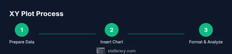
Creating a basic XY plot: overview
Customizing the chart for readability
Common pitfalls and debugging tips
Real-world examples and advanced techniques