Excel Data Analysis: A Practical Step-by-Step Guide
Learn practical excel data analysis with PivotTables, Power Query, and repeatable data models to turn raw data into actionable insights. A clear, XLS Library guide.

Excel data analysis is the process of inspecting, cleaning, and modeling data in Excel to discover useful insights and inform decisions. This guide shows practical techniques using PivotTables, Power Query, and built-in formulas to transform raw data into actionable findings, with a repeatable workflow for every project. Whether you are a student, analyst, or manager, this approach helps you deliver credible results faster. According to XLS Library, these methods emphasize approachable, practical steps you can apply today, using the exact Excel features professionals rely on. Get ready to turn messy lists into clear narratives and measurable outcomes.
What is Excel data analysis?
Excel data analysis is the practice of examining and interpreting data using Microsoft Excel, turning raw numbers into meaningful insights. At its core, it combines data cleaning, transformation, and exploratory analytics to inform decisions. According to XLS Library, excel data analysis blends practical techniques with built-in tools to produce repeatable results, whether you work in finance, marketing, or operations. By starting with a clear goal, you structure your dataset, choose the right tools, and document your approach. In Excel, you can track data quality, summarize large tables with shortcuts, and create dynamic views that respond to new data. The techniques you’ll learn here apply to many real‑world scenarios, from monthly sales reviews to customer segmentation. Embracing these methods helps you move from manual counting to systematic insight generation. This guide emphasizes approachable, practical steps you can apply today, using the exact Excel features that professionals rely on every day.
Why Excel remains a top choice for data analysis
Excel benefits from deep familiarity and broad compatibility. It sits at the center of most business workflows, integrates with other Office apps, and often serves as the first stop for quick data analyses. The XLS Library team notes that these strengths translate into faster onboarding, lower learning curves, and the ability to prototype analyses quickly. Even when teams later migrate to dedicated BI tools, Excel remains a powerful sandbox for exploring hypotheses, testing calculations, and sharing results in a universally accessible format. In addition, Excel supports a wide range of data sources, from simple CSV files to live connections, enabling analysts to work with both historical data and ongoing streams. For many professionals, mastering Excel data analysis is a practical gateway to data literacy and evidence-based decision making.
Core tools for data analysis in Excel
Key instruments include PivotTables for summarize-and-drill-down views, Power Query (Get & Transform) for clean data ingestion, and the Data Model for linking multiple tables. Formulas such as XLOOKUP, SUMIFS, and IFERROR provide pattern-based calculations that scale. When combined, these tools let you import data once, clean it systematically, create relationships between tables, and produce flexible analyses that adapt to new questions. The approach isn’t about memorizing tricks; it’s about choosing the right tool for the job and building a reproducible workflow that others can follow. In this guide, you’ll see practical examples that you can replicate in any Excel-enabled environment.
Preparing your data for analysis
Effective Excel data analysis begins with clean data. Start by ensuring headers are consistent, data types are uniform, and there are no stray spaces or non-printable characters. Remove duplicates and validate date formats, currency, and unit measurements. If you’re pulling data from multiple sources, harmonize column names and establish a standard schema. A well-prepared dataset reduces confusion during analysis and prevents subtle errors from creeping into calculations. As you progress, document the data provenance and any transformations so others can audit or extend your work. According to XLS Library, careful data preparation is often the difference between a good model and a reliable one.
Building a repeatable workflow
Design for reuse by creating a standard workbook structure with a data import sheet, a clean data sheet, and a separate analysis/report sheet. Use named ranges or a data model to lock in the structure, so new data can be appended without breaking formulas. Build templates for PivotTables and charts, and keep a changelog of updates to formulas and connections. Establish a simple naming convention for files, data sources, and outputs. By turning your procedure into a repeatable workflow, you save time, reduce errors, and enable teammates to reproduce results with confidence. This mindset aligns with best practices in data analysis and is central to sustainable Excel work.
Practical techniques: filtering, sorting, and aggregation
Learn to filter intelligently, sort by meaningful keys, and aggregate with robust functions. Use AutoFilter for quick views, and advanced filters for scenario analysis. Employ functions like SUMIFS, AVERAGEIFS, and COUNTIFS to summarize data with criteria, instead of relying on manual sums. When you create dashboards, link slicers to PivotTables so viewers can focus on segments or time periods. Remember to keep calculations simple and transparent; avoid hiding complexity behind long formulas that are hard to audit. Clear, well-documented techniques make your findings more trustworthy.
Using PivotTables to summarize data
PivotTables are at the heart of Excel data analysis, letting you pivot rows, columns, and values to reveal patterns. Start by placing a numeric field in Values, a category in Rows, and an attribute in Columns or Filters. Use value field settings to show sums, averages, or counts, and add calculated fields if needed. Refresh the PivotTable as new data arrives, and verify totals against the source. Create slicers and timelines to enable interactive exploration. A well-designed PivotTable reduces dozens of rows into a few key insights, which you can then illuminate with charts and conditional formatting.
Using Power Query and Power Pivot for advanced analyses
Power Query (Get & Transform) handles data ingestion and cleaning in a repeatable, auditable way. Create query steps to remove duplicates, normalize dates, and merge tables before analysis. Power Pivot lets you build a data model with relationships, so you can analyze large datasets across multiple tables efficiently. Use DAX formulas for calculated measures, which can be more readable and scalable than many traditional Excel formulas. If you’re working with more than a single workbook, consider centralizing your data model in a shared environment. In practice, Power Query and Power Pivot expand what Excel can do while keeping your workflow organized and transparent.
Data visualization in Excel: charts and dashboards
Excel’s chart library supports a broad range of visuals—from column and line charts to waterfall, combo, and heatmaps. Choose visuals that align with your story and keep color usage consistent. Dashboards should present a clear narrative: a headline KPI, supporting trends, and a couple of drill-down options. Use conditional formatting to highlight outliers, and anchor dashboards with a consistent layout so readers can quickly find the information they need. When sharing, export as PDF or publish a live workbook, and provide notes explaining data sources and assumptions. Effective visuals reinforce your analysis and make it easier for stakeholders to act on your findings.
Common pitfalls and how to avoid them
Avoid mixing data sources without alignment, which can lead to misleading conclusions. Be cautious about rounding and aggregation, as they can distort trends. Don’t rely on a single chart or metric; triangulate insights with multiple views. Document calculations and assumptions, so others can audit and extend your work. Finally, keep security in mind: protect sensitive data and restrict access to worksheets containing confidential information. By anticipating these issues, you’ll produce safer, more credible Excel data analyses.
Getting started: a sample project walkthrough
Imagine you’re analyzing monthly sales across regions. Start by importing the sales CSV, clean the fields, and create a data model linking regions to products. Build a PivotTable to summarize revenue by region and product, add a slicer for the month, and chart the trend. Save a template workbook so future months flow through the same pipeline. As you work, document each step, note any decisions, and prepare a short executive summary. This hands-on scenario shows how the concepts in this guide translate into real analyses using excel data analysis as the backbone.
Tools & Materials
- Microsoft Excel (365/2019 or later)(Windows or macOS, latest updates)
- Sample dataset (CSV/Excel)(Include headers and consistent data types)
- Blank workbook for models(Use separate sheets for data, model, and outputs)
- Power Query / Get & Transform(Built into modern Excel; ensure enabled if needed)
- External data sources (optional)(CSV, SQL, web data, etc.)
- Notebook or comments file(Document decisions and formulas)
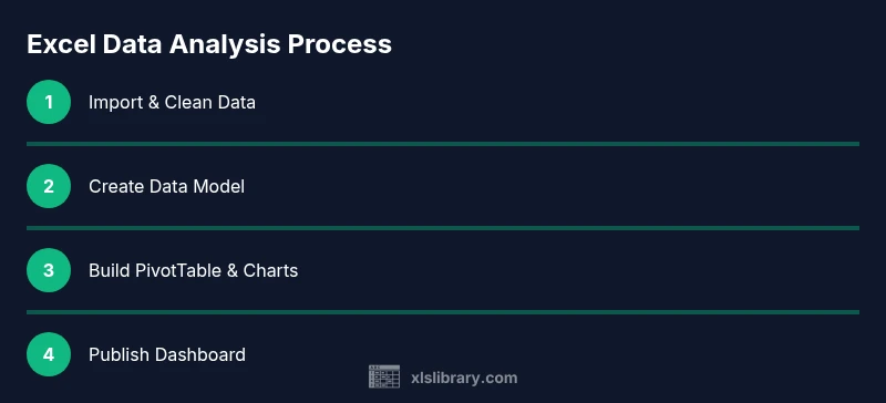
Steps
Estimated time: 2-3 hours
- 1
Import data from source
Connect to your data source or open the raw dataset in Excel. Confirm headers, check for missing values, and note any obvious inconsistencies. This step sets the foundation for reliable analysis.
Tip: If data arrives regularly, set up Power Query to pull and refresh automatically. - 2
Clean and normalize data
Remove duplicates, trim spaces, and standardize formats (dates, currency, units). Ensure consistent data types in every column to prevent type errors in formulas and pivots.
Tip: Use Power Query for repeatable cleaning steps that can be refreshed with new data. - 3
Define a stable schema
Create a flat table or a normalized model with clear column names. Record data provenance and document any transformations performed during cleaning.
Tip: A well-structured schema makes future updates painless and auditable. - 4
Create a data model (if needed)
If your analysis spans multiple tables, establish relationships in the Data Model. This enables cross-table analyses without duplicating data.
Tip: Name relationships clearly and test joins with a small test query first. - 5
Add calculated columns
Create reusable calculations (percent changes, margins, growth rates) that feed into pivots or dashboards. Keep calculations readable and well-commented.
Tip: Prefer calculated measures over repeated formulas to improve performance. - 6
Build a PivotTable
Place a numeric field in Values, a category in Rows, and an attribute in Columns or Filters. Adjust value summaries (sum, average, count) to reveal insights.
Tip: Always validate a PivotTable against a known subtotal to catch errors early. - 7
Create visuals
Add charts that illustrate key findings from the PivotTable. Use consistent color schemes and avoid chart clutter.
Tip: Link charts to slicers for interactive exploration by stakeholders. - 8
Assemble a dashboard
Combine PivotTables, charts, and metrics into a single dashboard sheet. Maintain a clean layout and include a short methodology note.
Tip: Test how viewers interact with filters; ensure the dashboard remains readable on different screens. - 9
Validate results
Cross-check totals, re-run calculations with alternative filters, and compare against the source data. Look for anomalies or outliers that deserve explanation.
Tip: Invite a colleague to review the logic; a second pair of eyes often catches issues you miss. - 10
Document and save
Add a brief data lineage and notes to the workbook. Save a template version for future projects and back it up.
Tip: Include a README with data sources, assumptions, and purpose of the workbook. - 11
Share insights responsibly
Provide a concise narrative alongside the workbook. Use screenshots or a one-page summary for non-technical audiences.
Tip: Export to PDF or publish a read-only view to prevent inadvertent edits. - 12
Iterate on feedback
Gather stakeholder feedback, refine calculations, update visuals, and refresh the data model as needed. Repeat the cycle to improve the analysis over time.
Tip: Treat each project as a learning loop to improve the next analysis.
People Also Ask
What is Excel data analysis?
Excel data analysis is the practice of examining data in Excel to extract insights using tools like PivotTables, Power Query, and formulas. It emphasizes clean data, repeatable steps, and transparent reporting.
Excel data analysis means using Excel tools like PivotTables and Power Query to turn data into insights, with clear steps and transparent reporting.
Do I need Power Query to analyze data in Excel?
Power Query is highly recommended for robust data ingestion and cleaning, especially when data sources change or update frequently. It makes repeated tasks reproducible.
Power Query helps you import and clean data consistently, which is especially useful when data sources update over time.
Can Excel handle large datasets?
Excel can handle sizable datasets, particularly with data models and Power Query. For extremely large datasets, consider a dedicated BI tool or a backend database.
Excel handles many datasets well, but very large datasets may benefit from specialized tools for performance.
How do I prepare data for PivotTables?
Ensure clean headers, consistent data types, and normalized categories. Remove duplicates and verify calculations before creating PivotTables.
Make sure headers are clean and data types are consistent before building PivotTables.
What is a good workflow for Excel data analysis?
Import, clean, model, analyze with PivotTables, then visualize and document. Use templates to standardize each project.
Import data, clean it, model it, analyze with PivotTables, visualize, and document your steps.
Is Excel enough for advanced analytics or should I add Power BI?
Excel is a strong starting point; for advanced reporting and dashboards, consider integrating Power BI as data scales and stakeholder needs grow.
Excel is great for starters and mid-scale analyses, but Power BI can enhance dashboards for larger datasets.
Watch Video
The Essentials
- Define goals before analyzing data
- Use PivotTables and Power Query for repeatable work
- Clean data thoroughly before modeling
- Create reusable templates for future projects
- Document methods and assumptions for auditability